Fig. A.2
Download original image
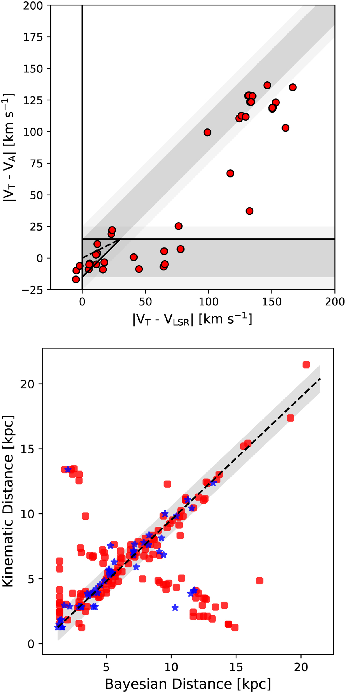
Top panel: Plot showing the difference in source velocity (Vlsr) and the velocity of tangent point (VT), versus the difference in the velocity of the first absorption minimum (VA) and the VT. The diagonal and horizontal shaded regions represent the expected location of the near and far distance sources, respectively, while the solid line shows the approximate boundaries (Kolpak et al. 2003; Urquhart et al. 2012). The dashed diagonal line divides the darker triangular region in the lower left quadrant of the plot into two regions: sources above the line are more likely to be at a near distance, while those below are more likely to be at a far distance. Bottom panel: Plot showing the relation between the distance determined using the Bayesian method presented by Reid et al. (2016, 2019) and the near/far distance determined using the Reid et al. (2014) rotation curve. The red circles and blue stars represent the distances taken from literature and obtained distance for 53 H II regions, respectively. The solid black line shows the line of equality, and the gray shaded region represents ±1 kpc.
Current usage metrics show cumulative count of Article Views (full-text article views including HTML views, PDF and ePub downloads, according to the available data) and Abstracts Views on Vision4Press platform.
Data correspond to usage on the plateform after 2015. The current usage metrics is available 48-96 hours after online publication and is updated daily on week days.
Initial download of the metrics may take a while.