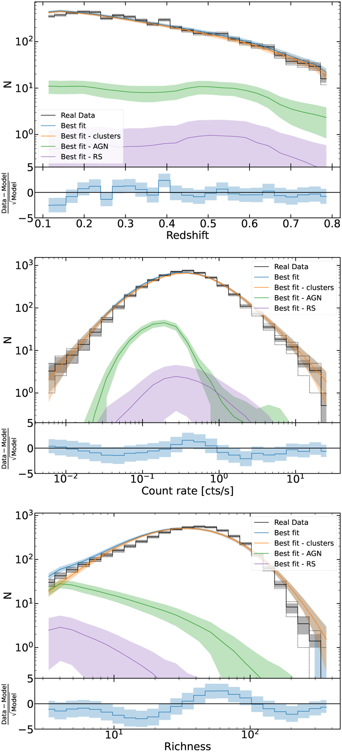
Fig. 6
Download original image
Distribution of clusters (black) as a function of redshift (top panel), count rate (middle panel), and richness (bottom panel) compared with the best fitting model prediction of the same quantities (blue) and the contribution to the total model from clusters (orange), AGN contamination (green), and RS contamination (purple). The black solid lines represent the data distribution, the shaded grey area the uncertainty due to measurement errors, and the black dotted lines indicate the Poisson uncertainty on the number of objects in each bin. In all figures, the bottom panel shows the Poisson Pearson residuals and the 2σ contours of the best-fit model.
Current usage metrics show cumulative count of Article Views (full-text article views including HTML views, PDF and ePub downloads, according to the available data) and Abstracts Views on Vision4Press platform.
Data correspond to usage on the plateform after 2015. The current usage metrics is available 48-96 hours after online publication and is updated daily on week days.
Initial download of the metrics may take a while.