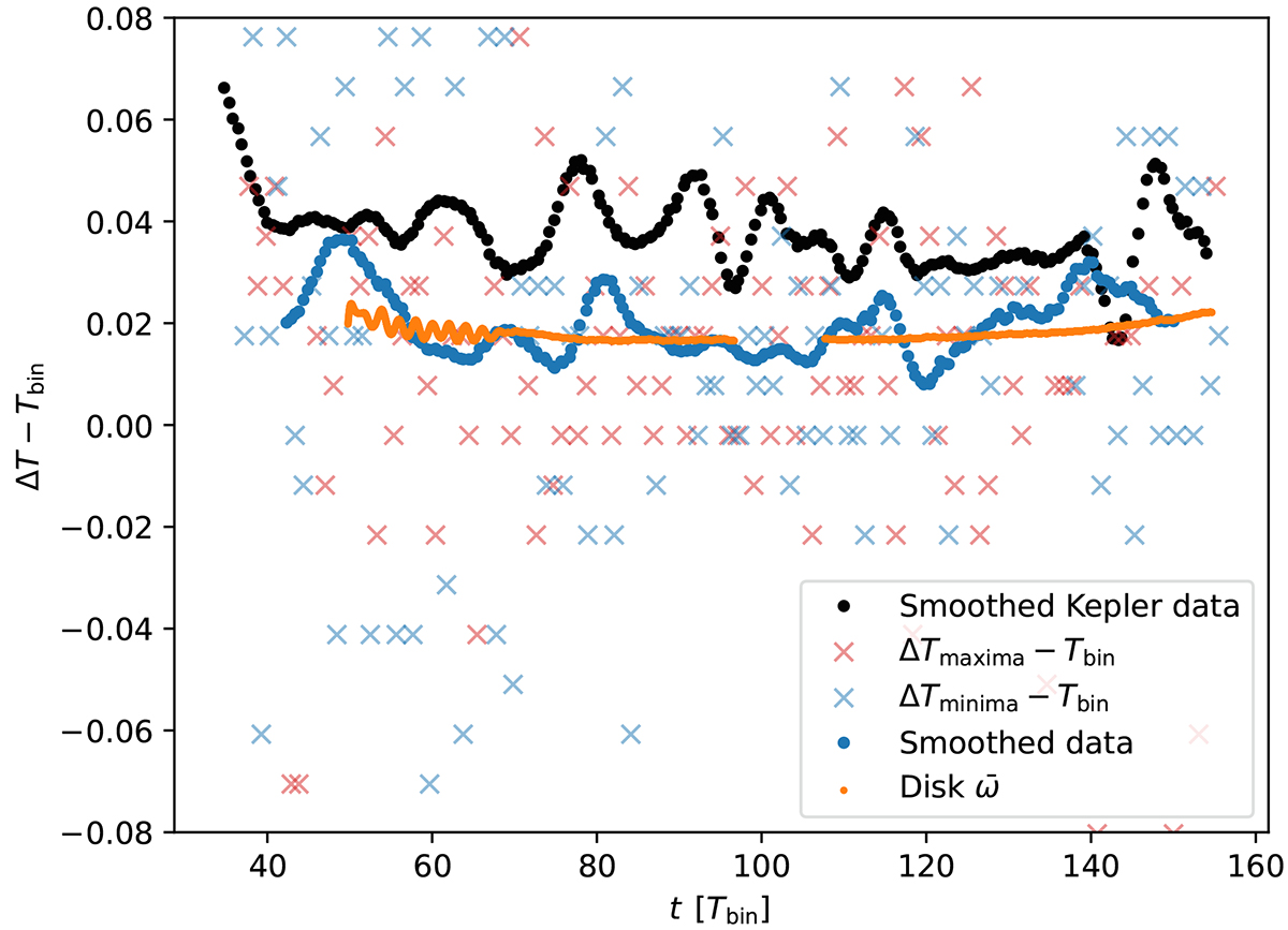
Fig. 16.
Download original image
Superhump excess calculated from adjacent peaks or minima for our variable mass transfer model (red or blue crosses, see the first panel in Fig. 14). The blue dots are an average of nearby data points and the orange dots are the precession rate of the disk. The black dots are the superhump excess computed from Kepler data of V1504 Cygni using an orbital period of 1.668 h (Coyne et al. 2012).
Current usage metrics show cumulative count of Article Views (full-text article views including HTML views, PDF and ePub downloads, according to the available data) and Abstracts Views on Vision4Press platform.
Data correspond to usage on the plateform after 2015. The current usage metrics is available 48-96 hours after online publication and is updated daily on week days.
Initial download of the metrics may take a while.