Fig. 3.
Download original image
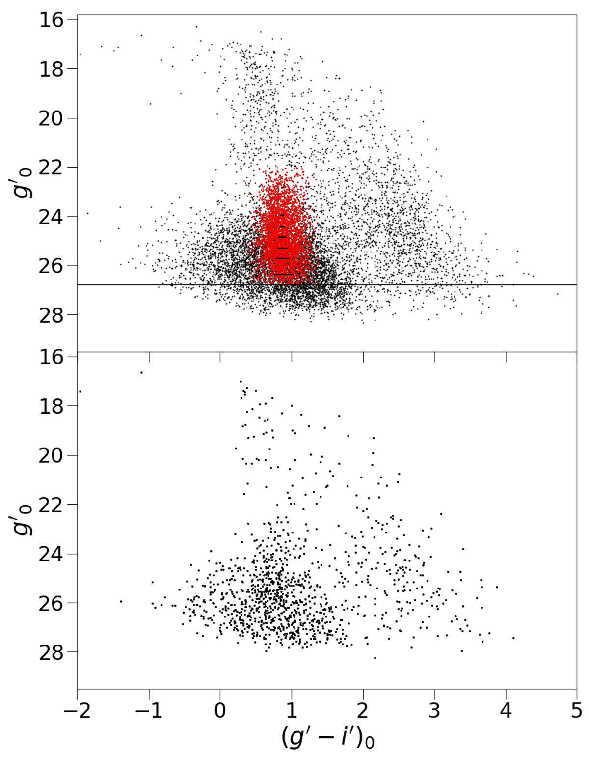
Comparison between the color magnitude diagram of the sources and that of the background regions. Top panel: color-magnitude diagram of the 10 970 sources (black dots) selected according to their shape. The plot shows the g′0 magnitude as a function of the (g′−i′)0 color. The horizontal line at g′0 = 26.789 shows the limit applied as conservative measure in order to avoid eventual color trends due to the incompleteness of the sample. The red dots represent the sources after the selection on color and magnitudes, and the black bars are the mean errorbars in the magnitude bins used to calculate the color distributions and the positions of the blue and red peaks. Bottom panel: color-magnitude diagram of the background regions. The plot shows the g′0 magnitude as a function of the (g′−i′)0 color for the 1138 sources located in the two rectangle regions of 6 × 1 arcmin2 used to calculate the background level.
Current usage metrics show cumulative count of Article Views (full-text article views including HTML views, PDF and ePub downloads, according to the available data) and Abstracts Views on Vision4Press platform.
Data correspond to usage on the plateform after 2015. The current usage metrics is available 48-96 hours after online publication and is updated daily on week days.
Initial download of the metrics may take a while.