Fig. 8.
Download original image
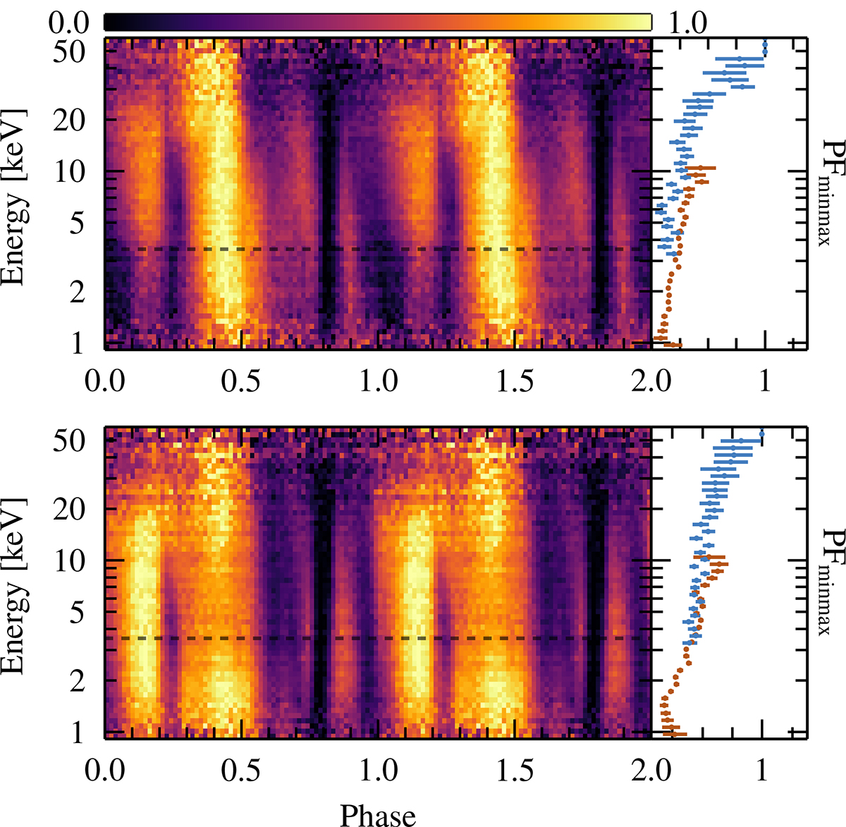
Pulse profile map illustrating the energy dependence of the pulse profiles. The upper plot corresponds to the first NuSTAR observation and the corresponding NICER data, similarly for the second observation. The same data is used as for Fig. 6. Dashed, black lines indicate the transition between NICER and NuSTAR data. To the right, the pulsed fraction (PF) is plotted as a function of energy; blue is for NuSTAR data and in orange is for NICER. We defined the PF as PF = (pmax−pmin)/(pmax+pmin).
Current usage metrics show cumulative count of Article Views (full-text article views including HTML views, PDF and ePub downloads, according to the available data) and Abstracts Views on Vision4Press platform.
Data correspond to usage on the plateform after 2015. The current usage metrics is available 48-96 hours after online publication and is updated daily on week days.
Initial download of the metrics may take a while.