Fig. 7.
Download original image
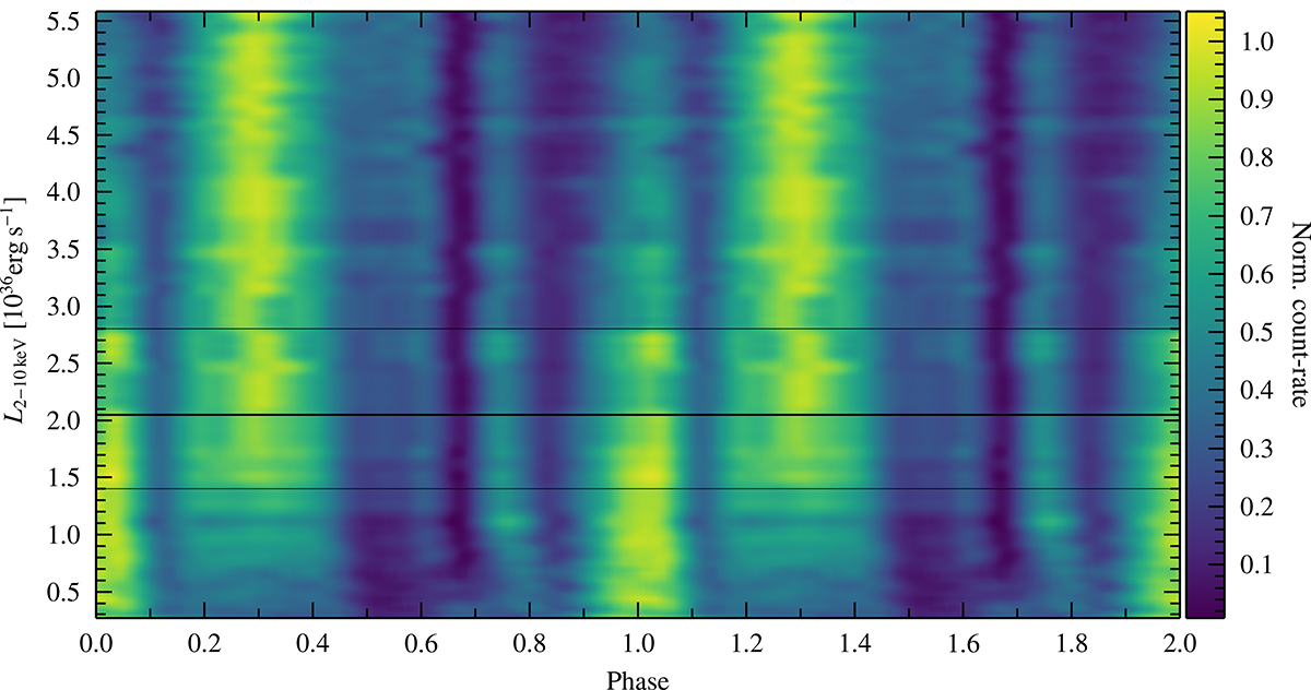
Pulse profile map scaled to range from zero to one for all included NICER observations sorted by their respective luminosity. This figure illustrates the luminosity dependence of the NICER pulse profiles. The thick black line indicates luminosities where the profile shows marked changes, and the thin lines serve as markers to indicate the approximate luminosity range over which the changes take place (see the Sect. 4.1 for more information).
Current usage metrics show cumulative count of Article Views (full-text article views including HTML views, PDF and ePub downloads, according to the available data) and Abstracts Views on Vision4Press platform.
Data correspond to usage on the plateform after 2015. The current usage metrics is available 48-96 hours after online publication and is updated daily on week days.
Initial download of the metrics may take a while.