Fig. F.3
Download original image
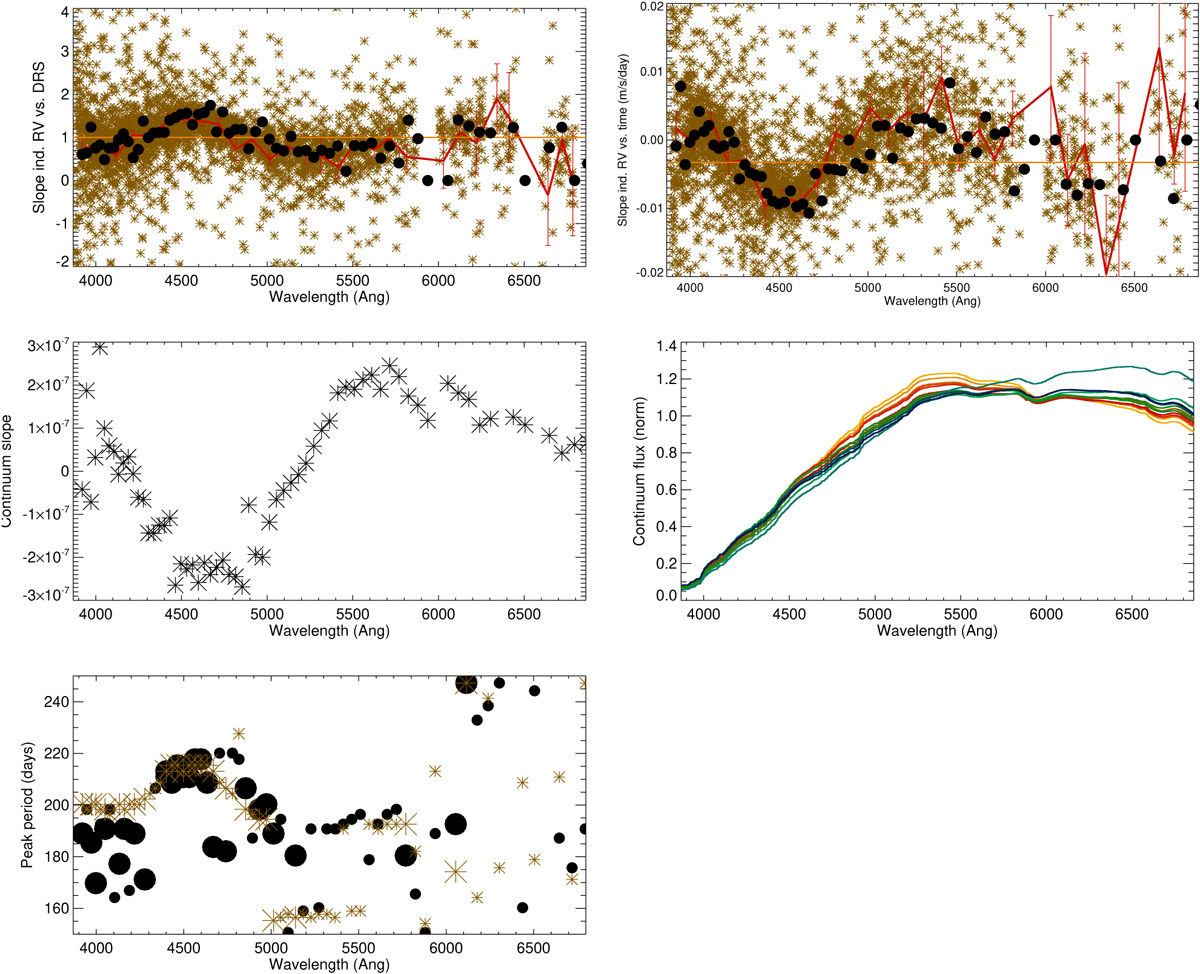
Slope of the individual RVs versus the DRS RV (upper left panel) and time (upper right panel) as a function of wavelength: CCF value for each diffraction order (black, error bars are plotted but smaller than the symbol size), individual line-by-line values (brown), binned values on line-by-line values (red), value for the DRS time series (orange horizontal lines). The ranges in ordinate have been restricted (outliers lie outside the visualised range, 9% in the upper panel and 16% in the lower panel). The slopes of Scont versus time are shown in the second row (left panel). The right panel in the second row shows 13 examples of daily continuum spread over time (from the beginning of the observations in yellow to the end in blue). The last panel shows the peak period (selected in the 150-250 days, the largest symbols corresponding to diffraction orders for which the peak in that period range is the highest peak in the periodogram) versus wavelength for the different diffraction orders: CCF analysis (black) and line-by-line analysis (brown).
Current usage metrics show cumulative count of Article Views (full-text article views including HTML views, PDF and ePub downloads, according to the available data) and Abstracts Views on Vision4Press platform.
Data correspond to usage on the plateform after 2015. The current usage metrics is available 48-96 hours after online publication and is updated daily on week days.
Initial download of the metrics may take a while.