Fig. 4
Download original image
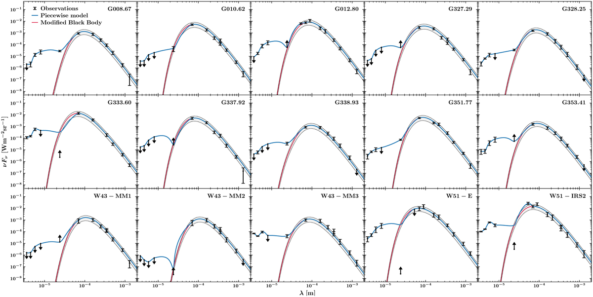
SEDs extracted from the ATLASGAL sources’ footprints (Contreras et al. 2013, Urquhart et al. 2014, see Sect. 3.3) corresponding to the protoclusters mapped by ALMA-IMF. The actual observations are represented by black points, while the red curve depicts the PPMAP MBB that provides the best fit to the data, with the gray shaded area representing the ±2σ standard deviation of the best fit. The blue curve represents the total piecewise model described in Sect. 3.3. Downward and upward arrows respectively correspond to lower limits and saturated observations.
Current usage metrics show cumulative count of Article Views (full-text article views including HTML views, PDF and ePub downloads, according to the available data) and Abstracts Views on Vision4Press platform.
Data correspond to usage on the plateform after 2015. The current usage metrics is available 48-96 hours after online publication and is updated daily on week days.
Initial download of the metrics may take a while.