Fig. 7.
Download original image
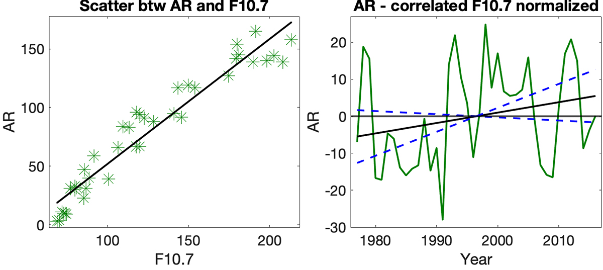
Correlation between the yearly number of active regions and the F10.7 flux. Left: scatterplot between the active regions and the F10.7 flux (green asterisks), together with the corresponding best-fit line (black). Right: difference between the yearly number of active regions and the correlated F10.7 flux. Best-fit line (black) and lines with slopes that are two standard deviations above or below the best-fit line slope (two blue dashed lines) are also included.
Current usage metrics show cumulative count of Article Views (full-text article views including HTML views, PDF and ePub downloads, according to the available data) and Abstracts Views on Vision4Press platform.
Data correspond to usage on the plateform after 2015. The current usage metrics is available 48-96 hours after online publication and is updated daily on week days.
Initial download of the metrics may take a while.