Fig. 12
Download original image
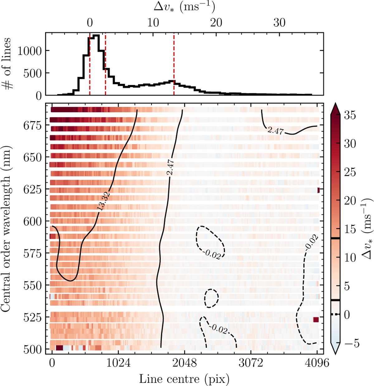
Differences between wavelengths of astrocomb lines measured using our empirical IP models and using Gaussian IPs, expressed as a velocity shift between the two (Eq. (27)). Main panel: Δυ, as a function of position on the detector. The zero point of the colour bar is set to Δυ* = 0 m s–1, such that the red and blue colours correspond to positive and negative velocity differences. Black contours more clearly visualise the distribution of Δυ* values across the detector. Contour limits correspond to the median and the central 68% distribution limits. A full line is used for positive contour levels and a dashed line for negative ones. Top panel: the histogram of the values plotted in the main panel. The vertical dashed red lines show the median and the central 68% region limits. The same quantities are shown as horizontal thick black lines in the colour bar to the right of the main panel.
Current usage metrics show cumulative count of Article Views (full-text article views including HTML views, PDF and ePub downloads, according to the available data) and Abstracts Views on Vision4Press platform.
Data correspond to usage on the plateform after 2015. The current usage metrics is available 48-96 hours after online publication and is updated daily on week days.
Initial download of the metrics may take a while.