Fig. C.1.
Download original image
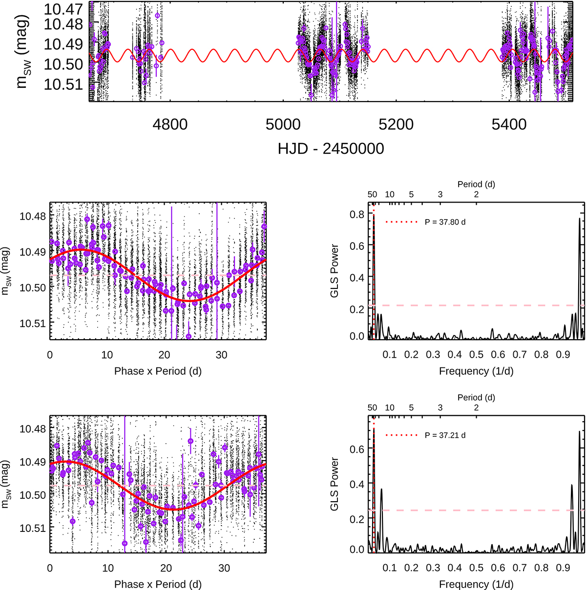
Example SuperWASP light curve for J22330+093. Top: all three seasons with black dots being the data points at every epoch. The purple circles and corresponding error bars represent the daily-binned points, computed as described in the text. In red we overplot the sinusoid parametrized by the best period from the second season. The best period is at 37.8 d in the second season (HJD ∼5100, middle panels) and agrees well with that in season 3 (37.2 d, HJD ∼5400, bottom panels). The pink dashed line in the light curve denotes the best-fit mean magnitudes, whereas in the periodograms it corresponds to FAP = 0.1%.
Current usage metrics show cumulative count of Article Views (full-text article views including HTML views, PDF and ePub downloads, according to the available data) and Abstracts Views on Vision4Press platform.
Data correspond to usage on the plateform after 2015. The current usage metrics is available 48-96 hours after online publication and is updated daily on week days.
Initial download of the metrics may take a while.