Fig. 7
Download original image
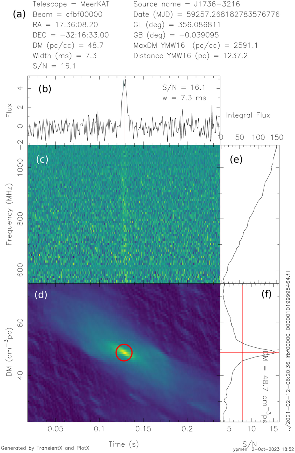
Example candidate plot, created by TRANSIENTX. Panel a presents the essential meta-information about the pulse. Panel b displays the pulse profile. Panel c depicts the dynamic spectrum of the pulse. Panel d illustrates the S/N distribution in the DM-time plane after applying the matched filter. Panel e shows the pulse bandpass. Panel f shows the S/N vs. DM relation. The vertical solid red lines represent the S/N threshold, and the horizontal solid line denotes the measured DM of the pulse. The data path of the pulse are indicated along the right border.
Current usage metrics show cumulative count of Article Views (full-text article views including HTML views, PDF and ePub downloads, according to the available data) and Abstracts Views on Vision4Press platform.
Data correspond to usage on the plateform after 2015. The current usage metrics is available 48-96 hours after online publication and is updated daily on week days.
Initial download of the metrics may take a while.