Fig. 3
Download original image
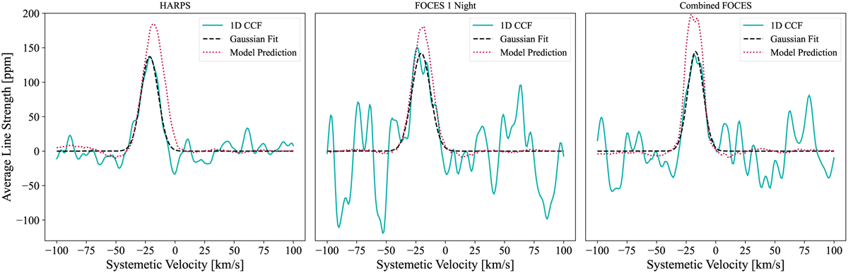
Comparison of 1D CCFs for the Fe I signal between different datasets extracted from the peak of each KpVsys plot. Each panel represents the data from a different source: HARPS-N, FOCES Night 1, and FOCES nights 1, 2, and 3 combined, respectively. In each plot, the teal line represents the one-dimensional cross-correlation function, the black dashed line is the Gaussian fit to the peak in the plot, and the red dotted line is the model prediction, as discussed in Sect. 4.3. There is a small discrepancy in the model peak height for each result; this is likely driven by the larger wavelength range of FOCES, which changes the predicted cross-correlation result. The model-predicted CCF has values of slightly below zero near the peak of the function. This observation is attributed to cross-correlation aliases, a phenomenon explained in Borsato et al. (2023).
Current usage metrics show cumulative count of Article Views (full-text article views including HTML views, PDF and ePub downloads, according to the available data) and Abstracts Views on Vision4Press platform.
Data correspond to usage on the plateform after 2015. The current usage metrics is available 48-96 hours after online publication and is updated daily on week days.
Initial download of the metrics may take a while.