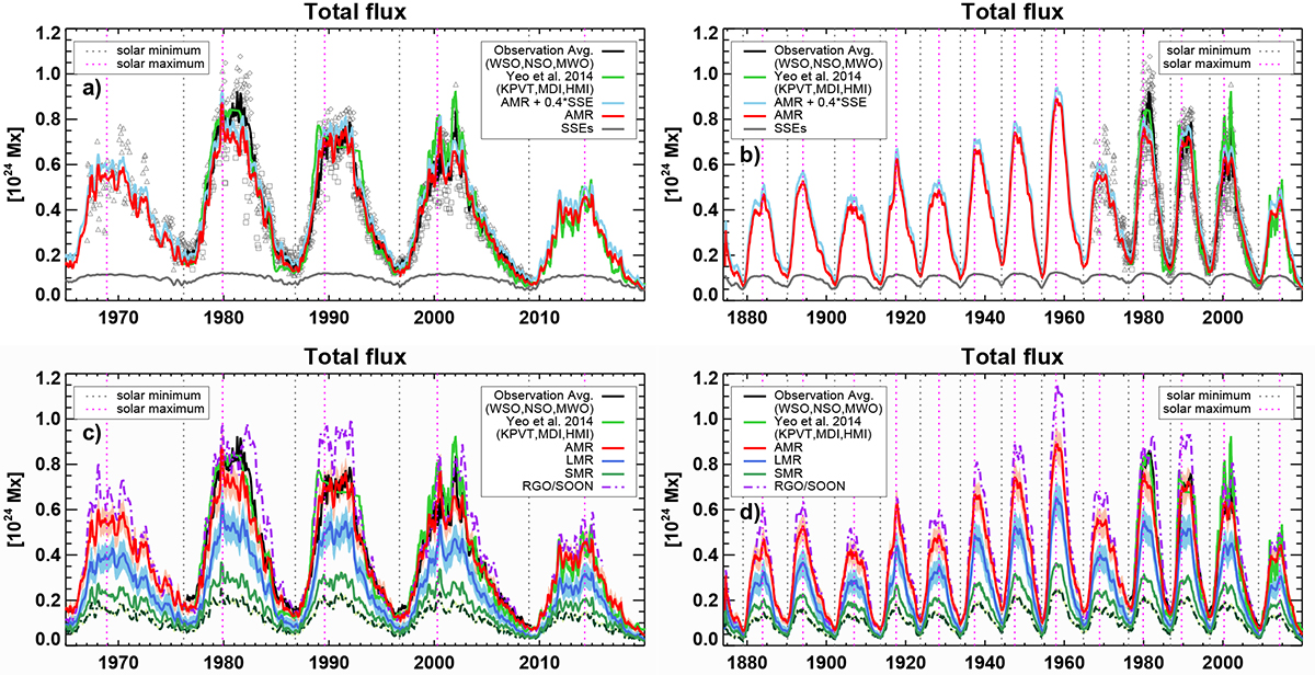
Fig. 4.

Download original image
Comparison of the simulation results of the total magnetic flux with observations. (a) Evolution of the (3-months smoothed) total magnetic flux from AMRs over cycles 20–24 and comparison with observations. (b) Same as above but over the entire modelled period from 1874 to 2020. (c) and (d) Comparison of all the simulation runs with error estimates overplotted. Plotted quantities: The light blue line in panels a and b is the mean of 100 realisations used as input to the SFTM plus 0.4 times the contribution of SSEs estimated from ordinary differential equations following Krivova et al. (2021), see the main text for details. The total flux from SSEs is plotted in grey. As a comparison we plot the average (black line – all panels) and individual measurements (dark grey symbols – only panels a and b) of three ground based observatories (WSO, NSO KP, MWO). The total magnetic flux from the KP/MDI/HMI composite by Yeo et al. (2014) is shown in light green in all panels. AMR without SSEs is shown in red in panels a and b, and the means of the LMR and SMR runs in panels c and d are shown in blue and green, respectively. The difference between the AMR and LMR runs is shown by the darker green dot-dashed line (which is the lowest curve in in panels c and d). The shaded areas are the standard deviations. The results from the RGO/SOON record are shown by the dash-dotted purple line.
Current usage metrics show cumulative count of Article Views (full-text article views including HTML views, PDF and ePub downloads, according to the available data) and Abstracts Views on Vision4Press platform.
Data correspond to usage on the plateform after 2015. The current usage metrics is available 48-96 hours after online publication and is updated daily on week days.
Initial download of the metrics may take a while.


