Fig. 2.
Download original image
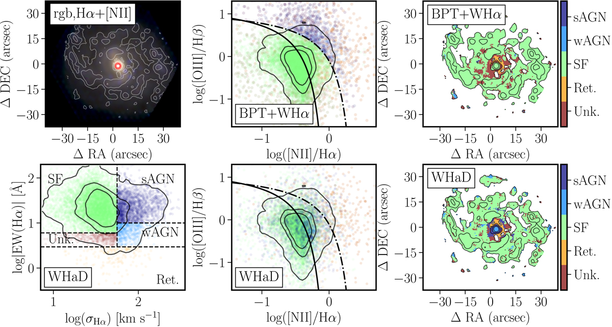
Comparison between the classical BPT and the new proposed diagnostic diagram for resolved properties. Top-left panel: RGB-image created using the r-, g-, and r-band images synthetized from the eCALIFA datacube of NGC 5947, together with a set of contours showing the Hα+[N II] flux intensities, with the 1st contour corresponding to the mean value minus one standard deviation, and each sucesive contour followig a multiplicative scale of five times that value. The red-circle indicates the central aperture adopted along this article (e.g., Fig. 1). Top-middle panel: Classical diagnostic diagram showing the distribution of [O III]/Hβ line ratio as a function of the [N II]/Hα ratio for each individual spaxel of the same cube shown in the top-left panel, color coded by nature of the ionization according to the classification based on locaton in this diagram together with the EW(Hα), thus, the same selection criteria adopted in top-left panel of Fig. 1: SF in green, RG in orange and AGN-like ionization in blue. Top-right panel: Spatial distribution of the ionized gas for those spaxels with Hα above the mean minus one standard deviation value, color coded by the classication shown in the middle panel (i.e., BPT+WHα). Those spaxels with Hα flux with a S/N below 3 or any of the remaining emission lines involved in the BPT diagram below 1 are marked as unknown (dark-red color). Contours are the same already shown in the top-left panel. Bottom-left panel: Distribution along the WHaD diagram, EW(Hα) versus σHα, for the individual spaxels of the same datacube shown in the previous panels, color coded according to the classification of the ionizing source based on the location within this diagram. Bottom-middle panel: Diagnostic diagram similar to the one already shown in top-middle panel, with the individual spaxels color coded following the new classification based on the WHaD diagram (bottom-left panel). Bottom-right panel: Spatial distribution of the ionized gas similar to that shown in the top-right panel, this time color-coded with the classification obtained using the WHaD diagram shown in the bottom-left. The similarities and differences between the two classiciation schemes are evident when comparing top- and bottom-right panels.
Current usage metrics show cumulative count of Article Views (full-text article views including HTML views, PDF and ePub downloads, according to the available data) and Abstracts Views on Vision4Press platform.
Data correspond to usage on the plateform after 2015. The current usage metrics is available 48-96 hours after online publication and is updated daily on week days.
Initial download of the metrics may take a while.