Fig. D.1
Download original image
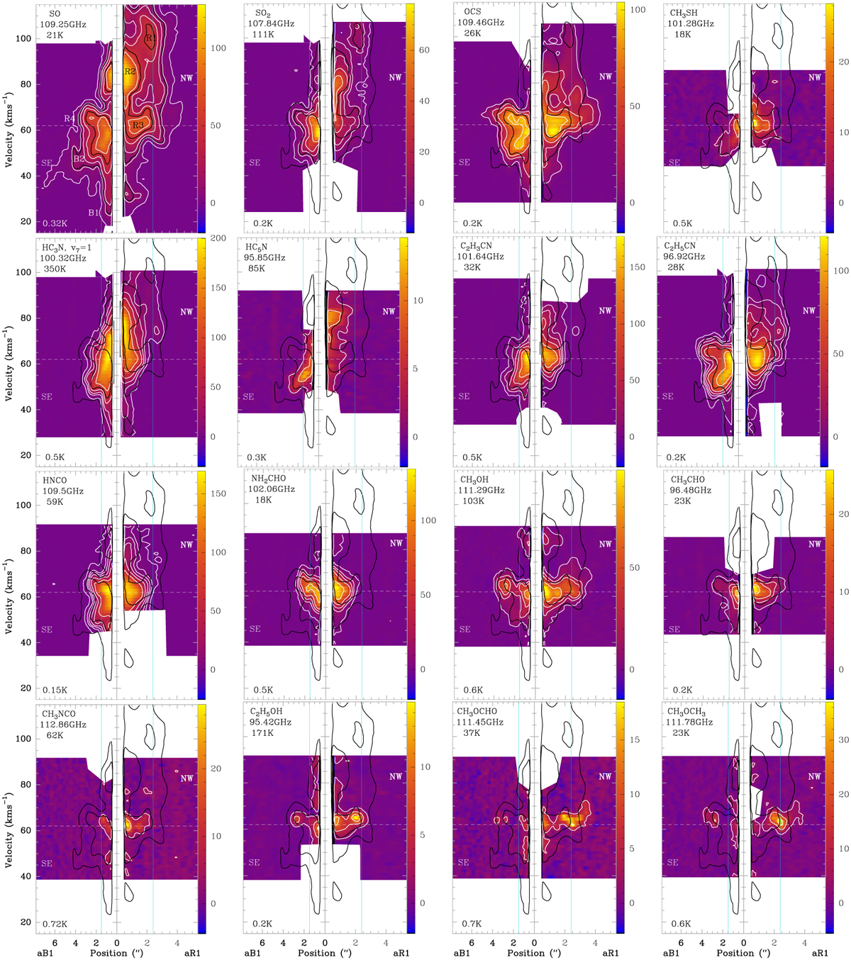
Position-velocity diagrams along the solid black arrows labelled aR1 and aR1 in Fig. 2. Here, the position labelled 0 corresponds to the centre of the hot core. The colour scale and white contours apply to the molecule written in the top left corner together with the frequency and upper-level energy of the used transition. White contours are at 5σ, 25σ and then increase by a factor 2, where σ was measured in an emission-free region in the respective data cube and is written in the bottom left corner. Although the region closest to the centre of the hot core and those identified with contaminating emission from other species are masked in white, some weak emission from other molecules may still be included at distances >1″ to the SW and NW. Black contours always show SO emission at 30σ and 150σ. The maximum and minimum velocities shown in each map correspond to the outer integration limits used in Figs. C.1–C.3, if existing. The white dashed line marks an average systemic velocity of 62 km s−1. Highlighted features in blue-shifted emission towards the south-east (SE, in the position-position maps) include B1 (elongated along velocity axis) and B2 (elongated along both axes). Intensity peaks in red-shifted emission towards the north-west (NW) are labelled R1 and R2, and red-shifted emission features close to the systemic velocity are labelled R3 (NW) and R4 (SE). Positions N1SE1 and N1NW3 are indicated with light-blue solid lines.
Current usage metrics show cumulative count of Article Views (full-text article views including HTML views, PDF and ePub downloads, according to the available data) and Abstracts Views on Vision4Press platform.
Data correspond to usage on the plateform after 2015. The current usage metrics is available 48-96 hours after online publication and is updated daily on week days.
Initial download of the metrics may take a while.