Fig. B.1
Download original image
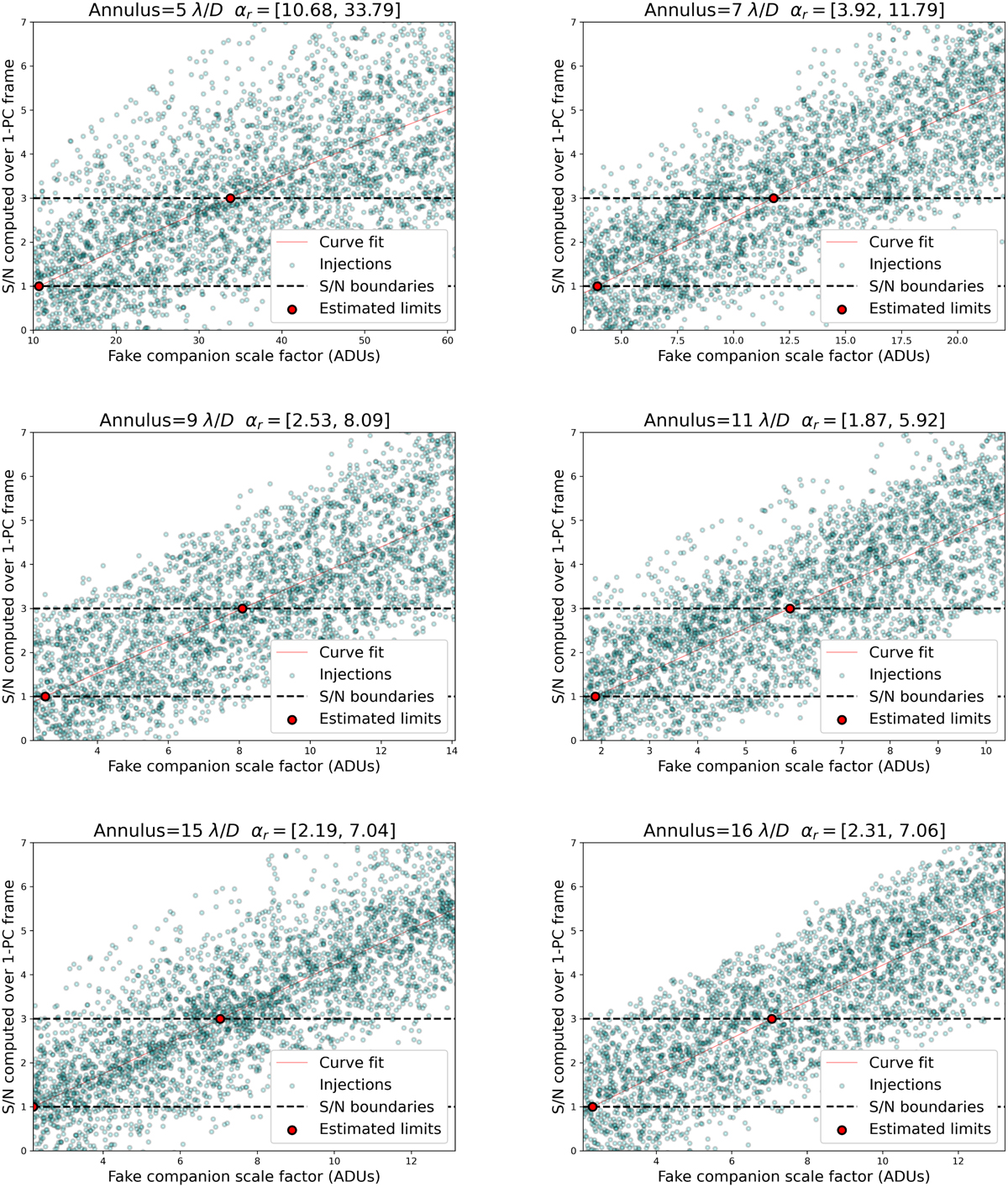
Example of the injection flux estimation method for the case of the sph2 sequence. Each subplot refers to a different angular separation, and shows the S/N of an injection (y axis), retrieved from the PCA post-processed frame with one principal component, as a function of its scale factor (x axis). Each point in cyan on subplots thus represents a fake companion, which has been injected in the ADI sequence at random coordinates within the corresponding annulus and with a random scale factor. The thin red line is the curve fit of all injections, and dashed horizontal curves in black delimit the chosen S/N range, which is from one to three in this case. The two red dots show the intersection between the curve fit and the S/N limits (step 6), which therefore define the range of the scale factor corresponding to the chosen S/N limits.
Current usage metrics show cumulative count of Article Views (full-text article views including HTML views, PDF and ePub downloads, according to the available data) and Abstracts Views on Vision4Press platform.
Data correspond to usage on the plateform after 2015. The current usage metrics is available 48-96 hours after online publication and is updated daily on week days.
Initial download of the metrics may take a while.