Fig. 3.
Download original image
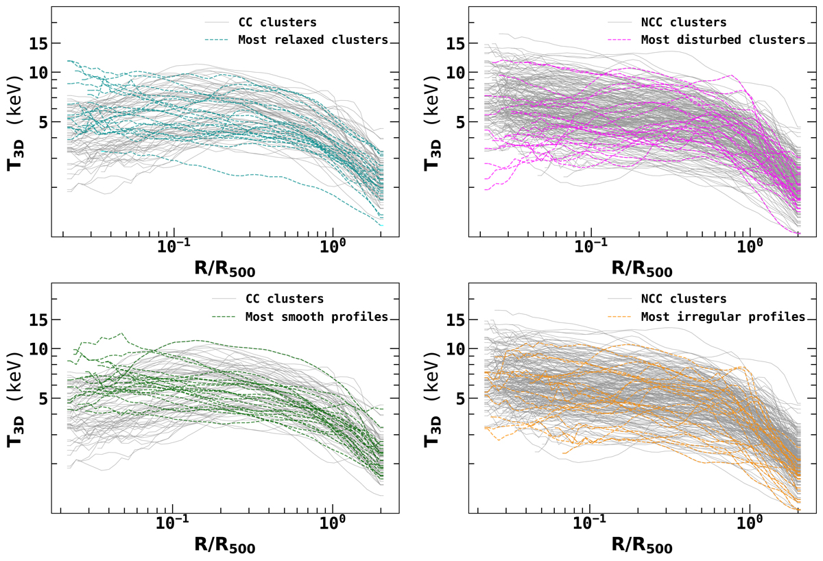
Classification of temperature profiles in the THREE HUNDRED PROJECT. Left panel: Grey line shows the visually classified CC clusters. Cyan and green lines show the 20 most relaxed clusters (top panel) and 20 most smooth profiles (bottom panel). Right panel: Grey line shows the visually classified NCC clusters. Magenta and orange lines show the 20 most disturbed clusters (top panel) and irregular profiles (bottom panel).
Current usage metrics show cumulative count of Article Views (full-text article views including HTML views, PDF and ePub downloads, according to the available data) and Abstracts Views on Vision4Press platform.
Data correspond to usage on the plateform after 2015. The current usage metrics is available 48-96 hours after online publication and is updated daily on week days.
Initial download of the metrics may take a while.