Fig. 7
Download original image
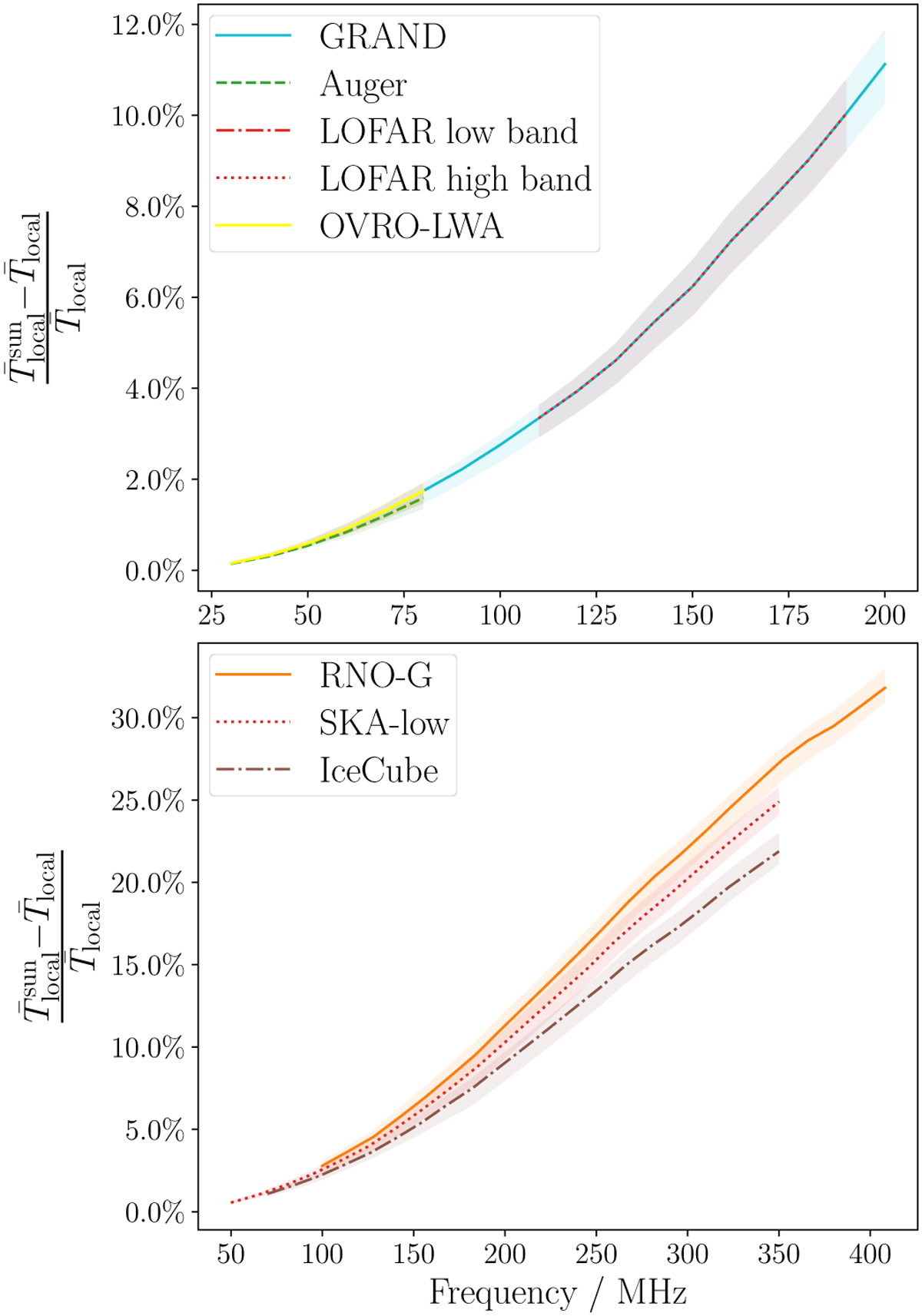
Relative difference of the average temperature of the local sky induced by the quiet Sun for the selected radio arrays. The lines represent the average results from using the seven sky models to produce the maps, while the maximum and minimum contribution from any model is shown by the colored bands. Arrays at lower frequencies are shown in the top part, while arrays at higher frequencies are shown in the bottom part. Kinks in the curves are due to quantization effects in the calculations.
Current usage metrics show cumulative count of Article Views (full-text article views including HTML views, PDF and ePub downloads, according to the available data) and Abstracts Views on Vision4Press platform.
Data correspond to usage on the plateform after 2015. The current usage metrics is available 48-96 hours after online publication and is updated daily on week days.
Initial download of the metrics may take a while.