Fig. 6.
Download original image
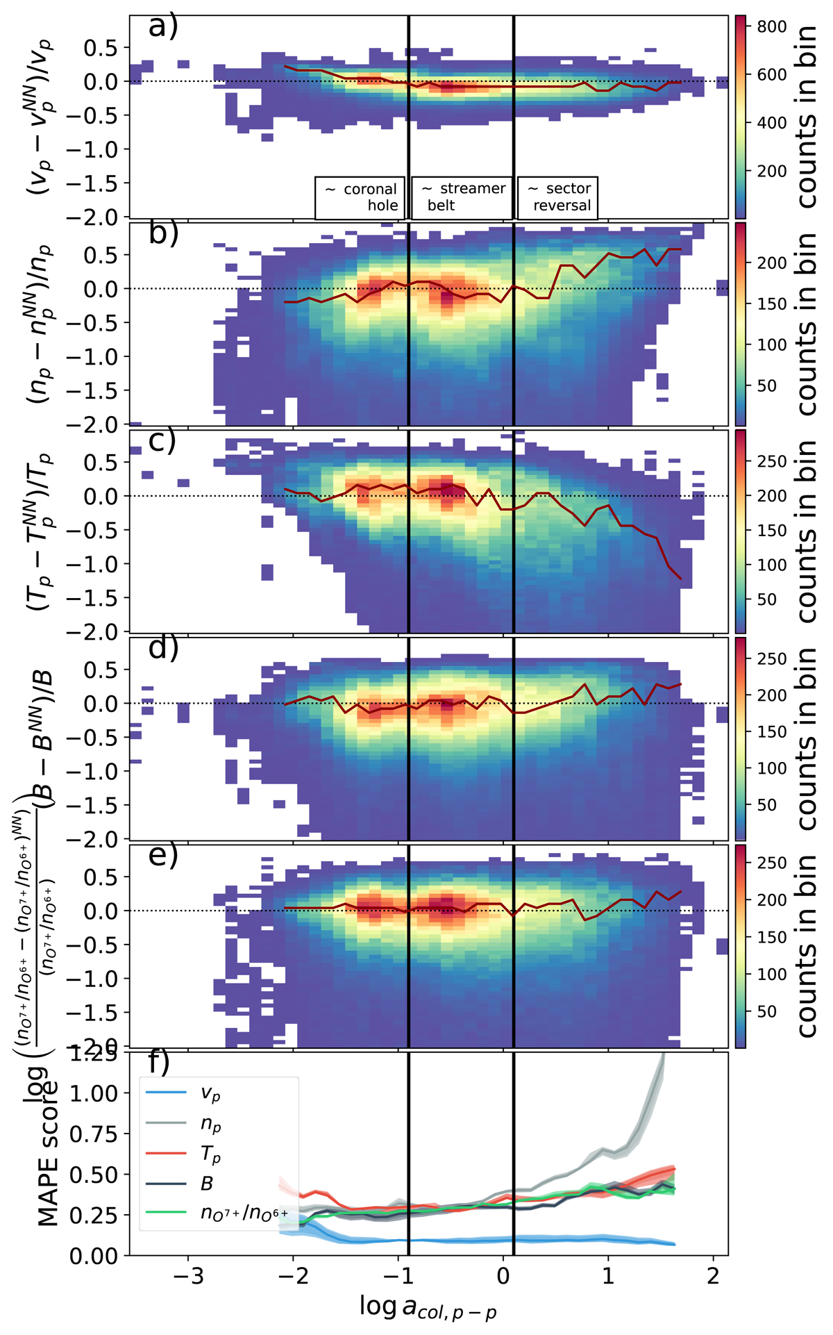
Two-dimensional histograms of the relative reconstruction error (a, b, c, d, e) and MAPE score (f) for each reconstructed solar wind parameter over the proton–proton collisional age (from top to bottom: vp, np, Tp, B, and nO^7+/nO^6+). For the first five subplots, the y-axis shows the normalised differences between the reconstruction and the measured data. The x-axis shows the proton–proton collisional age. In all panels, data are sorted into 50 bins between −3.5 and 2.2 on the x-axis, and in panels (a–e) the data are sorted into 50 bins between −2.0 and 1.0 on the y-axis. The vertical black lines give approximate thresholds separating sector reversal from streamer belt plasma (right black line) and streamer belt plasma from coronal hole wind (left black line). The red line highlights the maximum of the distribution in each vertical slice with sufficient statistics (at least 5000 data points over all Monte Carlo runs per column). The bottom-most subplot shows the MAPE scores (on the y-axis) computed separately for all test data points falling into the respective proton–proton collisional age bin (on the x-axis) for each reconstructed solar wind parameter. The MAPE score is calculated according to Eq. (6). Confidence intervals in panel (f) are given as three overlapping areas per curve (15.9th–84.1th percentile, 2.5th–97.5th percentiles, and 0th–100th percentiles).
Current usage metrics show cumulative count of Article Views (full-text article views including HTML views, PDF and ePub downloads, according to the available data) and Abstracts Views on Vision4Press platform.
Data correspond to usage on the plateform after 2015. The current usage metrics is available 48-96 hours after online publication and is updated daily on week days.
Initial download of the metrics may take a while.