Fig. 4
Download original image
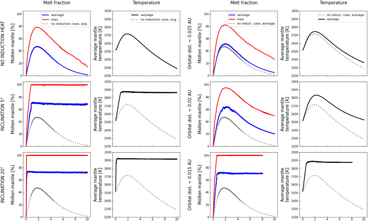
Magmatic simulations for the heating rates shown in Fig. 2. Blue lines represent the fraction of molten mantle in percent, averaged over the entire mantle from the core-mantle boundary to the surface of the planet, while the red lines show the maximal occurring local degrees of melting. Left panel: reference simulation without induction heating shown in the first row, followed by different inclination angles of 5° and 20° in the subsequent rows. The behaviour of 10° and 15° curves is qualitatively similar to the 5° and 20° cases. The first column illustrates the maximum and average degree of melting in the mantle, and the second column shows the average mantle temperature depending on time. On the plots that include induction heating, the grey dashed line shows the curve without induction heating for comparison. Right panel: same as for the other panel, but for different orbital distances. At orbital distances larger than 0.025 au, induction heating does not significantly influence the thermal evolution. The x-axes show time in Gyr.
Current usage metrics show cumulative count of Article Views (full-text article views including HTML views, PDF and ePub downloads, according to the available data) and Abstracts Views on Vision4Press platform.
Data correspond to usage on the plateform after 2015. The current usage metrics is available 48-96 hours after online publication and is updated daily on week days.
Initial download of the metrics may take a while.