Fig. B.1.
Download original image
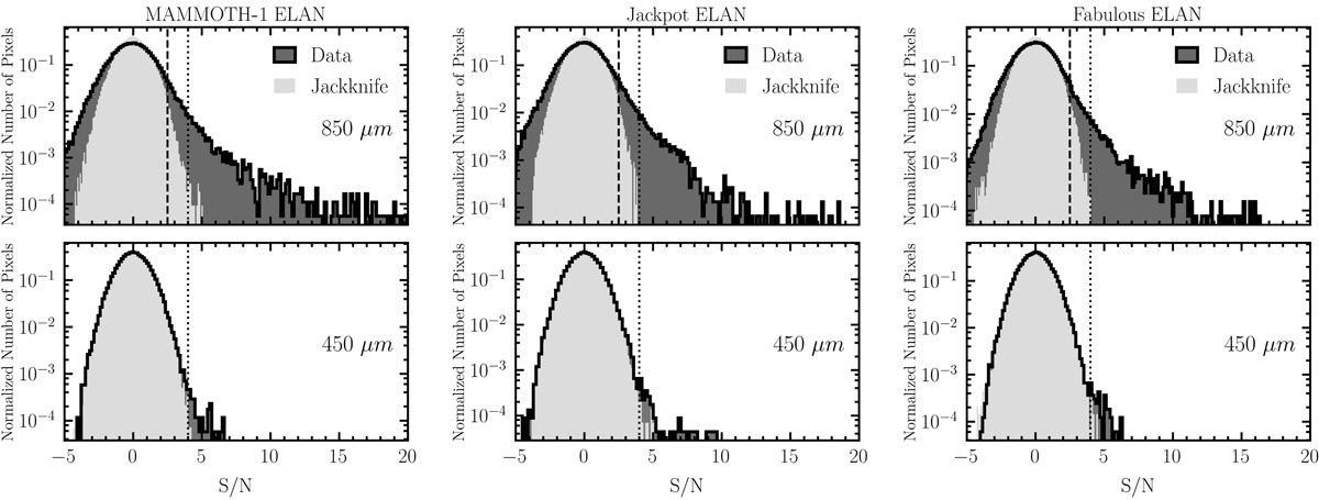
Normalized histograms of the S/N values for the pixels within the effective area of the 850 and 450 μm maps. The light and dark gray histograms indicate the distributions of the jackknife maps and of the data, respectively. The data, especially at 850 μm, show excesses at high S/N where sources contribute to the distribution. The dashed vertical line represents the cut used in the simulations of the number counts (see Table 2). The dotted line represents the threshold (4σ) above which we catalog sources.
Current usage metrics show cumulative count of Article Views (full-text article views including HTML views, PDF and ePub downloads, according to the available data) and Abstracts Views on Vision4Press platform.
Data correspond to usage on the plateform after 2015. The current usage metrics is available 48-96 hours after online publication and is updated daily on week days.
Initial download of the metrics may take a while.