Fig. 4

Download original image
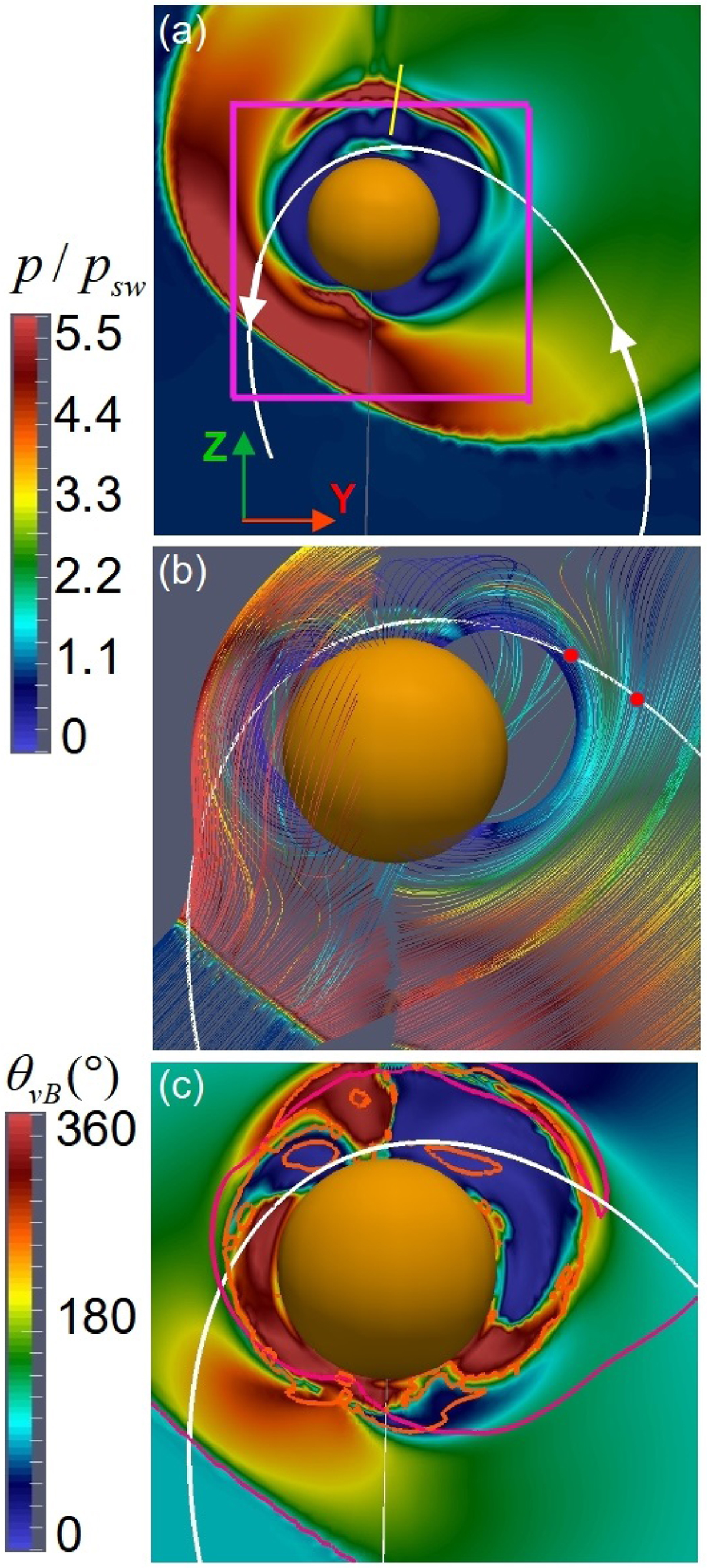
Magnetosphere cut in the plane of the satellite trajectory. (a) Plasma pressure distribution in the plane of the satellite trajectory (solid white line). The white arrows indicate the satellite displacement orientation along the orbit. The pink square shows the zoom-in region plotted in the other panels. The yellow line crossing the local maximum of the plasma pressure indicates the magnetosphere region we analyzed in panel 6b. (b) Magnetic field lines connected to the satellite trajectory. The magnetic field line colors indicate the plasma pressure (same scale as in panel a). The red dots show MESSENGER access and exit of the SMS. (c) Angle between the plasma velocity and the magnetic field. The pink isoline indicates the magnetosphere region in which the pressure is 2.5 higher than the SW pressure. As a reference, the orange contour indicates the loci in which the plasma flow speed is equal to phase speed of the slow mode with antiparallel k vector.
Current usage metrics show cumulative count of Article Views (full-text article views including HTML views, PDF and ePub downloads, according to the available data) and Abstracts Views on Vision4Press platform.
Data correspond to usage on the plateform after 2015. The current usage metrics is available 48-96 hours after online publication and is updated daily on week days.
Initial download of the metrics may take a while.


