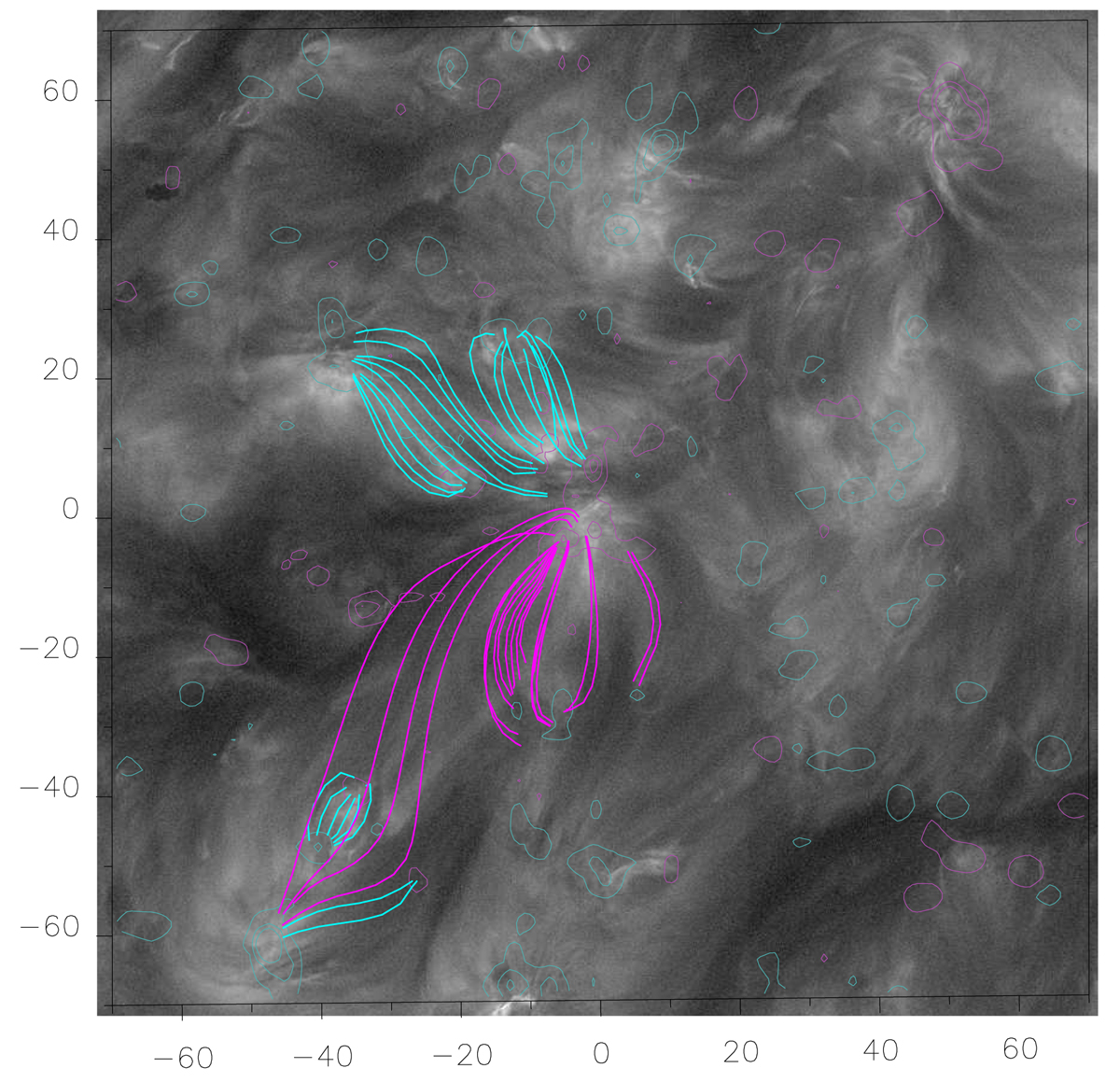
Fig. 6.

Download original image
Magnetic field model of the region surrounding the positive HMI polarity where the strong upflows are located. The model is overlaid on the HRIEUV image at around 08:25 UT, shown in grey scale. Computed field lines (in pink) matching the global shape of the observed loops have been added for those anchored in the upflowing plasma region (see the comments in the text). Other sets of loops are shown in light blue for context. The axes in the panel are in units of Mm, with the origin in the region of interest. The isocontours of the LOS field correspond to ±10, ±50, and ±100 G; pink shows positive values and blue negative values.
Current usage metrics show cumulative count of Article Views (full-text article views including HTML views, PDF and ePub downloads, according to the available data) and Abstracts Views on Vision4Press platform.
Data correspond to usage on the plateform after 2015. The current usage metrics is available 48-96 hours after online publication and is updated daily on week days.
Initial download of the metrics may take a while.


