Fig. 7
Download original image
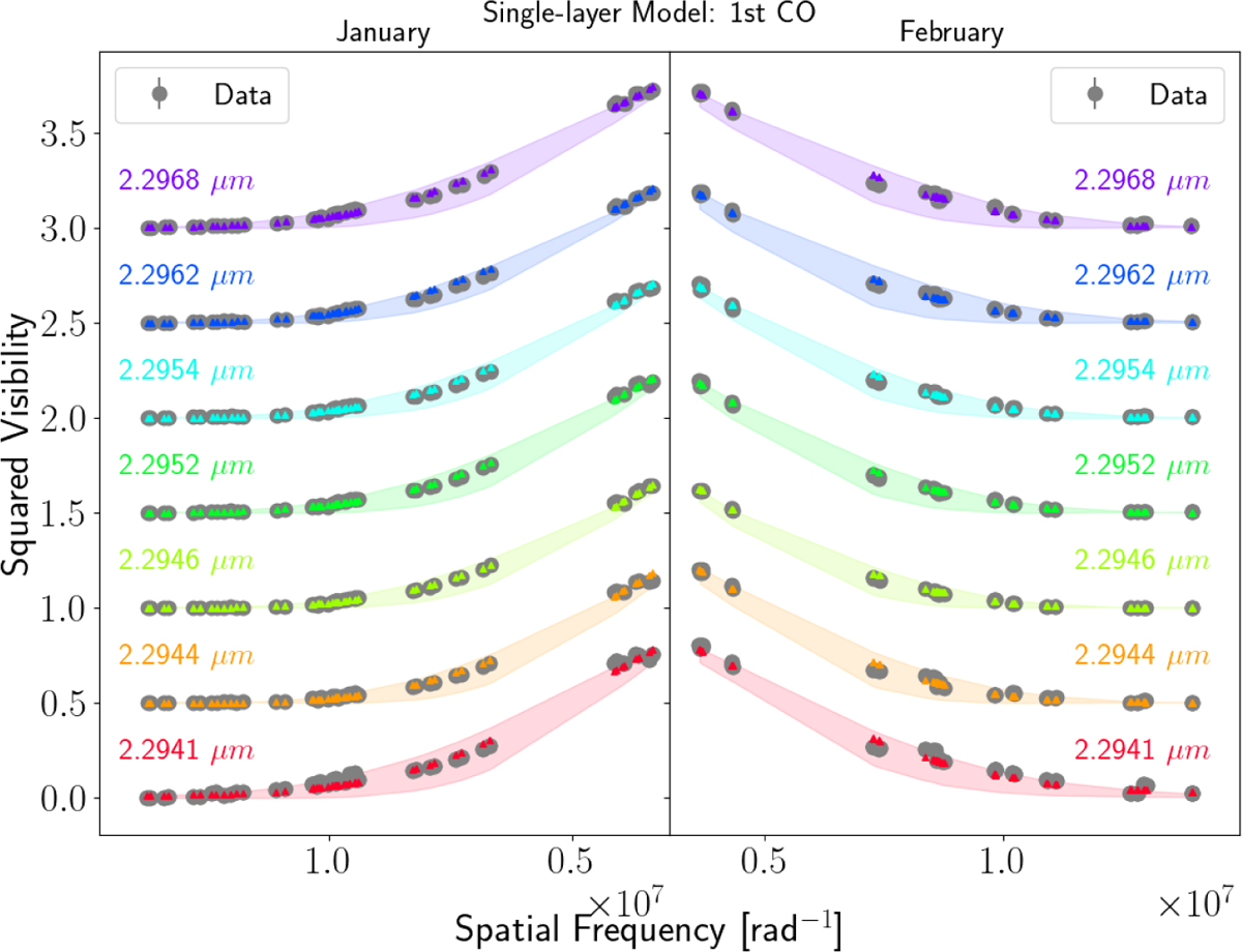
Best fit to V2 from the best single-layer models across the first CO band head for our two epochs. The colored dots and the shaded regions correspond to the best-fit models and their corresponding error-bars. Each color correspond to a different wavelength (see labels on the plot). The data are shown with black dots. We highlight that the spatial frequencies increase in opposite directions depending on the epoch. This allowed us to have a better visual comparison of the trends present in the V2 data between the two epochs. Also, for better visualization, we displaced the V2 vertically.
Current usage metrics show cumulative count of Article Views (full-text article views including HTML views, PDF and ePub downloads, according to the available data) and Abstracts Views on Vision4Press platform.
Data correspond to usage on the plateform after 2015. The current usage metrics is available 48-96 hours after online publication and is updated daily on week days.
Initial download of the metrics may take a while.