Fig. 27.
Download original image
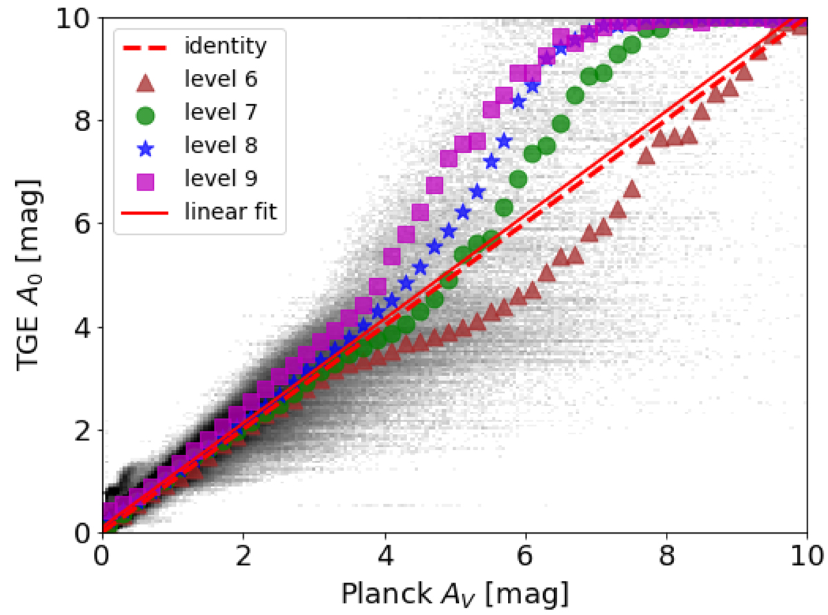
Comparison of the extinction between the TGE A0 optimum HEALPix map and the Planck AV HEALPix level 9 map for extinctions up to 10 mag. The background grey scale is a density plot of the entire optimal HEALPix TGE map (comprising the optimal HEALPixes at several HEALPix levels). The dashed red line represents unity and the solid red line is a linear fit of the medians of all HEALPixes in the optimum HEALPix map with 0.5 ≤ AV ≤ 3. Coloured symbols refer to the median A0 computed in AV bins of width 0.2 mag for various HEALPix levels that are used to assign the A0 value.
Current usage metrics show cumulative count of Article Views (full-text article views including HTML views, PDF and ePub downloads, according to the available data) and Abstracts Views on Vision4Press platform.
Data correspond to usage on the plateform after 2015. The current usage metrics is available 48-96 hours after online publication and is updated daily on week days.
Initial download of the metrics may take a while.