Fig. 26.
Download original image
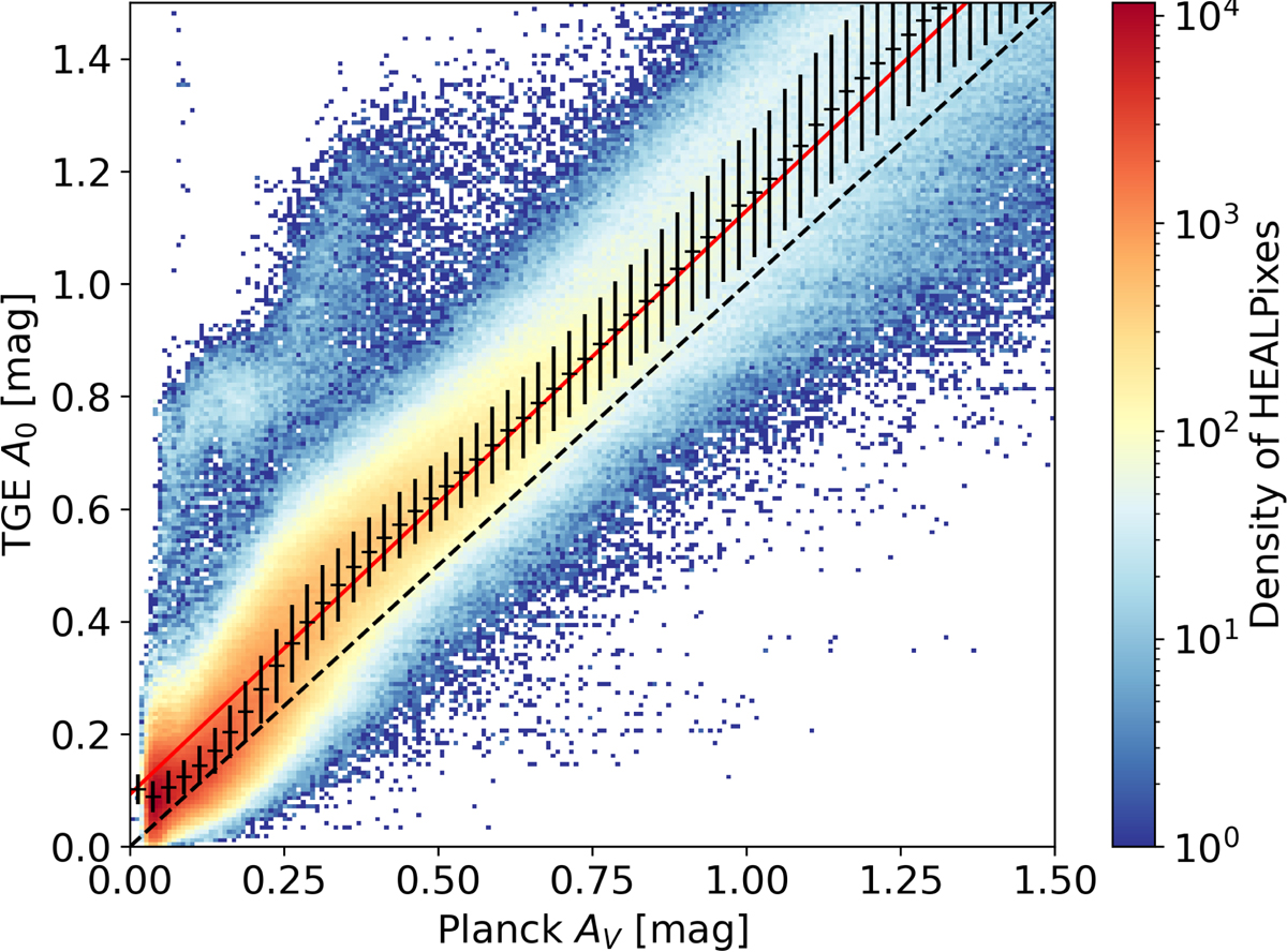
Extinction comparison between the TGE A0 optimum HEALPix map and the Planck AV HEALPix level 9 map at small extinction values. The colour scale shows the density of HEALPixes, the red dashed line represents unity, and the points with error bars are the median A0 and average absolute deviation computed in AV bins of width 0.025 mag. The red line is the result of a linear fit to the points.
Current usage metrics show cumulative count of Article Views (full-text article views including HTML views, PDF and ePub downloads, according to the available data) and Abstracts Views on Vision4Press platform.
Data correspond to usage on the plateform after 2015. The current usage metrics is available 48-96 hours after online publication and is updated daily on week days.
Initial download of the metrics may take a while.