Fig. 21.
Download original image
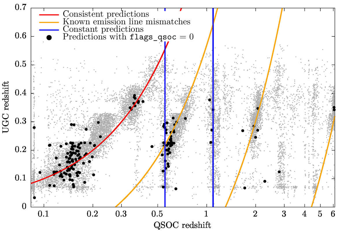
Comparison between the UGC and QSOC redshifts. Grey dots correspond to all redshifts in common between the two tables, while black dots are restricted to those with flags_qsoc = 0, which corresponds to a higher reliability subset. The red curve denotes identical predictions in the two modules. Yellow curves highlight mismatches between common quasar or AGN emission lines, as explained in Delchambre et al. (2023), while the blue vertical lines show constant predictions by QSOC.
Current usage metrics show cumulative count of Article Views (full-text article views including HTML views, PDF and ePub downloads, according to the available data) and Abstracts Views on Vision4Press platform.
Data correspond to usage on the plateform after 2015. The current usage metrics is available 48-96 hours after online publication and is updated daily on week days.
Initial download of the metrics may take a while.