Fig. 1.
Download original image
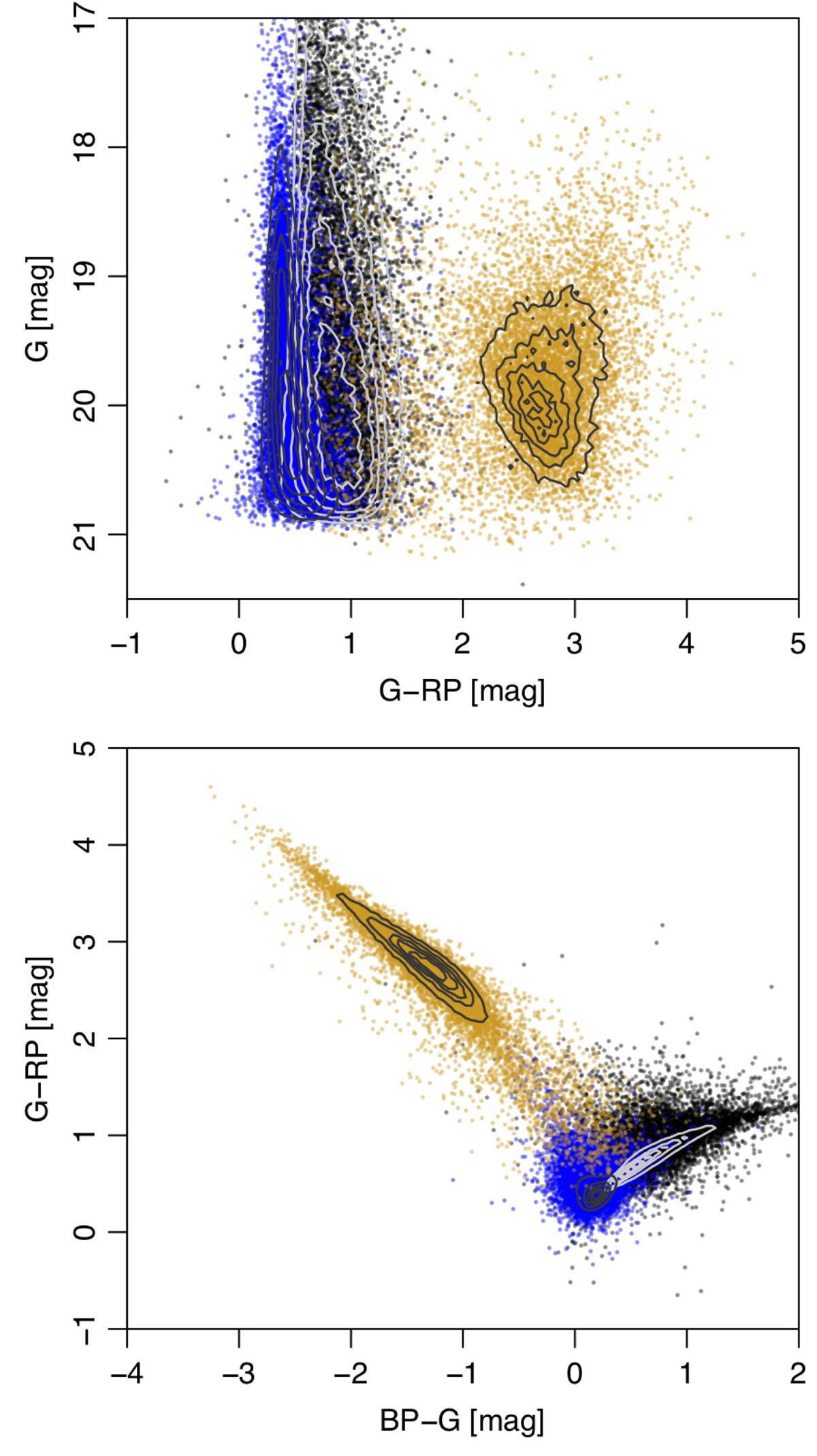
Colour–magnitude diagram (top) and colour–colour diagram (bottom) of the DSC training data for the quasars (blue) and galaxies (orange) as well as stars (black). The contours in each panel show the variation in source density on a linear scale. The points are equal-sized random subsets of sources from each class. There is significant overlap, in particular between stars and quasars: in reality the former dominate by a factor of about a thousand, and so overlap much more than is shown here. Plots for each class separately are provided in the online documentation.
Current usage metrics show cumulative count of Article Views (full-text article views including HTML views, PDF and ePub downloads, according to the available data) and Abstracts Views on Vision4Press platform.
Data correspond to usage on the plateform after 2015. The current usage metrics is available 48-96 hours after online publication and is updated daily on week days.
Initial download of the metrics may take a while.