Fig. 4.
Download original image
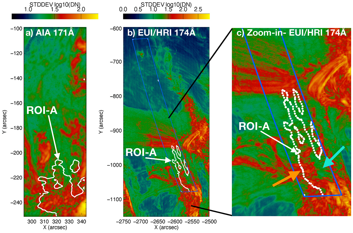
Map of the standard deviation of the coronal intensity with time observed with (a) AIA 171 Å and (b) HRIEUV. Panel c shows a zoom of the upflow region seen by the HRIEUV. The maps are computed for the time range between 00:32 to 00:52 UT on 30 March 2022. The contour highlights the ROI-A that spatially corresponds to the upflow region (velocity v < −5 km s−1) in Hinode/EIS map (Fig. 2b). In panel c, the orange arrow shows the region where there are rooted extended loops (see also Fig. 5) with the standard deviation higher than in the surroundings. The blue arrow shows the region with lower standard deviation intensity values than the extended loops footpoint region. The low standard deviation region corresponds to a low intensity region in the corona maps (see Fig. 5).
Current usage metrics show cumulative count of Article Views (full-text article views including HTML views, PDF and ePub downloads, according to the available data) and Abstracts Views on Vision4Press platform.
Data correspond to usage on the plateform after 2015. The current usage metrics is available 48-96 hours after online publication and is updated daily on week days.
Initial download of the metrics may take a while.