Fig. 3.
Download original image
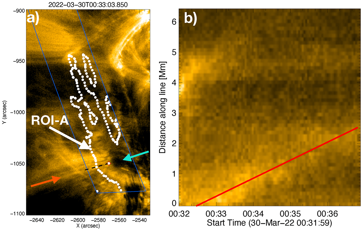
HRIEUV intensity image of the area corresponding to the Hinode/EIS upflow region and its surroundings (Fig. 2). In panel a, the white contour highlights the re-projected ROI-A that corresponds to the Hinode/EIS upflow region with Doppler upflow velocities v < −5 km s−1. The dashed black line highlights the location of the single-pixel-wide line used to measure the velocity along the loops. The extended loop is marked with a red arrow. The blue arrow shows a low-intensity area in the upflow region. Panel b shows a change in intensity along the extended loop with time obtained from HRIEUV observations (see the profile line in the figure to the left). The red line is fitted to the locations with the highest intensity and has a velocity of 9.9 ± 0.4 km s−1. All panels are scaled to the same intensity range (900−2300 DN/s). The footpoint of the extended loop has a Doppler velocity determined by Hinode EIS of −8.6 ± 2.3 km s−1 (Fig. 2).
Current usage metrics show cumulative count of Article Views (full-text article views including HTML views, PDF and ePub downloads, according to the available data) and Abstracts Views on Vision4Press platform.
Data correspond to usage on the plateform after 2015. The current usage metrics is available 48-96 hours after online publication and is updated daily on week days.
Initial download of the metrics may take a while.