Fig. 1
Download original image
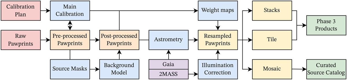
Pipeline overview chart depicting a simplified version of the data flow within the VISIONS pipeline. Each tile represents a specific processing stage where one or more recipes are executed. Tiles with a red background indicate raw input data obtained from the ESO science archive. Blue tiles denote calibration files, such as flat fields and tables to linearize the detector response. Orange tiles refer to intermediate science data products. Yellow tiles mark processed science data from which publication-ready products (green tiles) are generated. The purple tile indicates data from external sources, which correspond to the source catalogs from the 2MASS survey and the Gaia mission. The arrows mark the interdependencies between the consecutive processing stages.
Current usage metrics show cumulative count of Article Views (full-text article views including HTML views, PDF and ePub downloads, according to the available data) and Abstracts Views on Vision4Press platform.
Data correspond to usage on the plateform after 2015. The current usage metrics is available 48-96 hours after online publication and is updated daily on week days.
Initial download of the metrics may take a while.