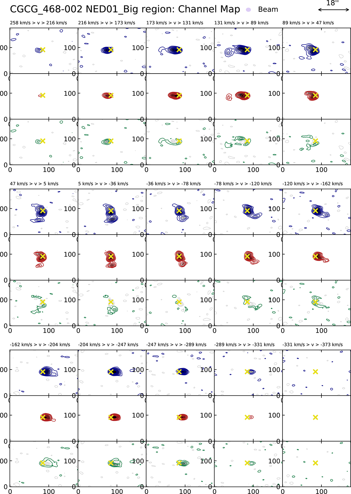
Fig. 8.
Download original image
CO channel maps computed by integrating the CO(1–0) emission in channels of Δv = 42 km s−1, showing the comparison between data and BBarolo best-fit disk model within the Big region around NED01. In each of the three panels, the top row (blue contours) displays the data, the central row the model (red contours), and the bottom row the residual emission (green contours). The contours are plotted at 3, 6, 9, 15, 20, 30, 40, 50σ. Symmetric negative contours are plotted in grey. The yellow cross indicates the centre of the disk model.
Current usage metrics show cumulative count of Article Views (full-text article views including HTML views, PDF and ePub downloads, according to the available data) and Abstracts Views on Vision4Press platform.
Data correspond to usage on the plateform after 2015. The current usage metrics is available 48-96 hours after online publication and is updated daily on week days.
Initial download of the metrics may take a while.