Fig. 4
Download original image
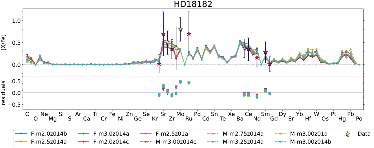
Comparison between observed abundanced and classifications plus the residuals of the classifications. Top panel: comparison between the observed abundances (star symbols where red/yellow symbols are elements that are included/excluded in our classification) and results (lines) of nearest-neighbour algorithm. Bottom panel: residuals of the classification (i.e. observed abundance minus predicted abundance for each element). This star is difficult to classify because the abundances in the first s-process peak are higher than predicted by the best-fit models.
Current usage metrics show cumulative count of Article Views (full-text article views including HTML views, PDF and ePub downloads, according to the available data) and Abstracts Views on Vision4Press platform.
Data correspond to usage on the plateform after 2015. The current usage metrics is available 48-96 hours after online publication and is updated daily on week days.
Initial download of the metrics may take a while.