Fig. 2.
Download original image
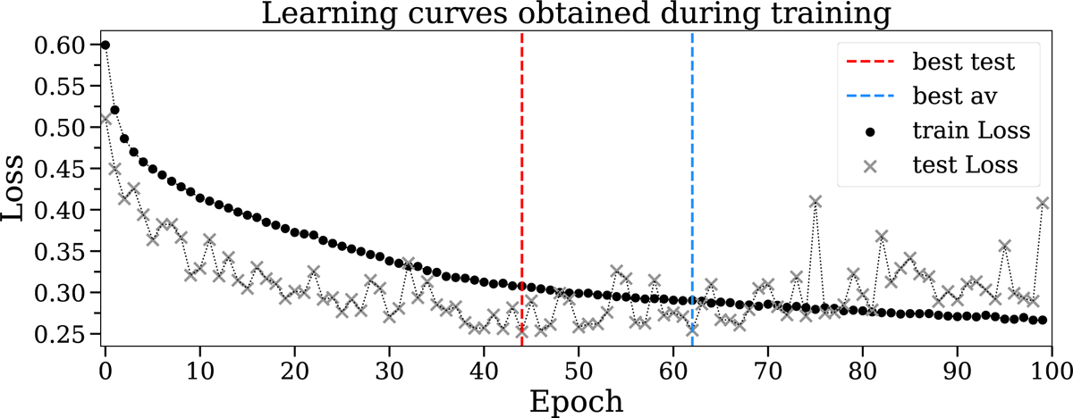
Example of learning curves obtained during training. The black and gray curves indicate the performance (in terms of loss) of a model on both the training (black) and test (gray) set. The best model could either be the model that scored the lowest loss on the test set (red dashed line), or the average lowest loss on both the training and test sets (blue dashed line). Notice that after about 50 epochs the test loss starts to increase, indicating a possible overfitting of the training data.
Current usage metrics show cumulative count of Article Views (full-text article views including HTML views, PDF and ePub downloads, according to the available data) and Abstracts Views on Vision4Press platform.
Data correspond to usage on the plateform after 2015. The current usage metrics is available 48-96 hours after online publication and is updated daily on week days.
Initial download of the metrics may take a while.