Fig. 17.
Download original image
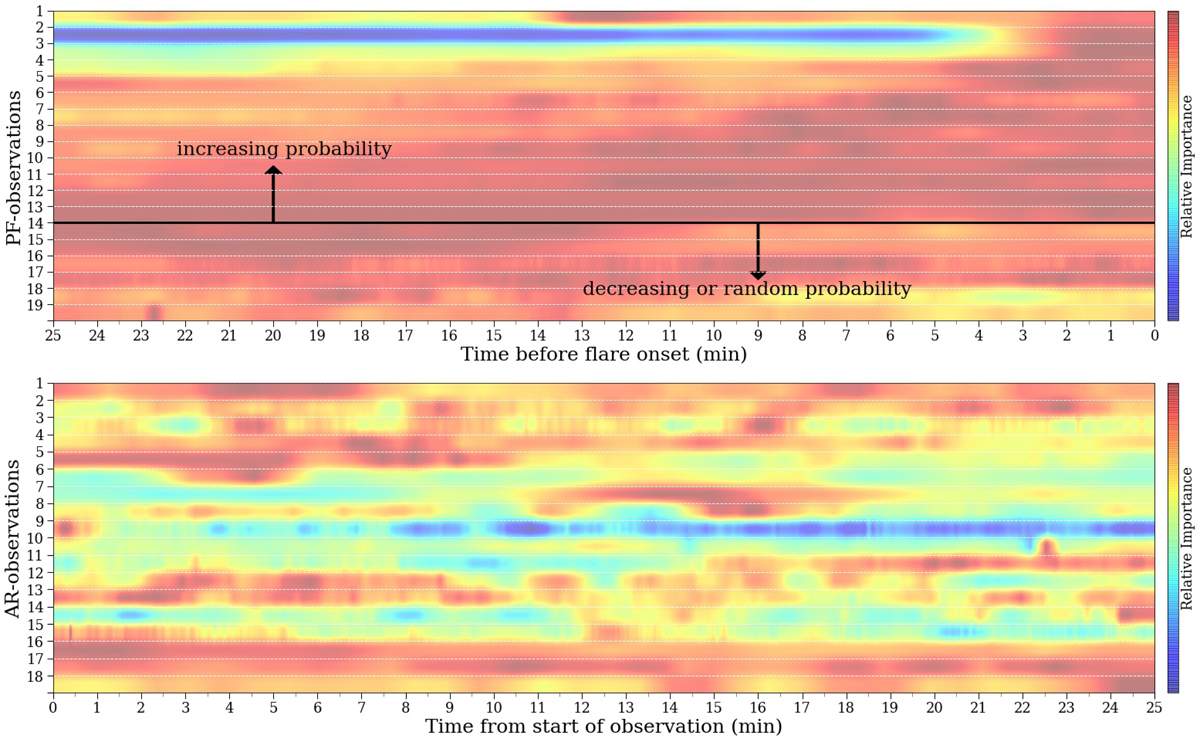
Attributions for all observations. The top and bottom panel indicate the variation across all pixels and rasters of the models prediction score with time for all PF and AR observations respectively. Each row is normalized by its maximum value, and corresponds to a single observation. Higher relative prediction scores are indicated by warmer colors. We see that the PF observations (top) are much more structured and tend to predict flares more strongly closer to flare onset, while the AR scores (bottom), result in a heatmap that is far more sporadic in time. The numbers on each panels y-axis correspond to the observation numbers listed in Table D.1.
Current usage metrics show cumulative count of Article Views (full-text article views including HTML views, PDF and ePub downloads, according to the available data) and Abstracts Views on Vision4Press platform.
Data correspond to usage on the plateform after 2015. The current usage metrics is available 48-96 hours after online publication and is updated daily on week days.
Initial download of the metrics may take a while.