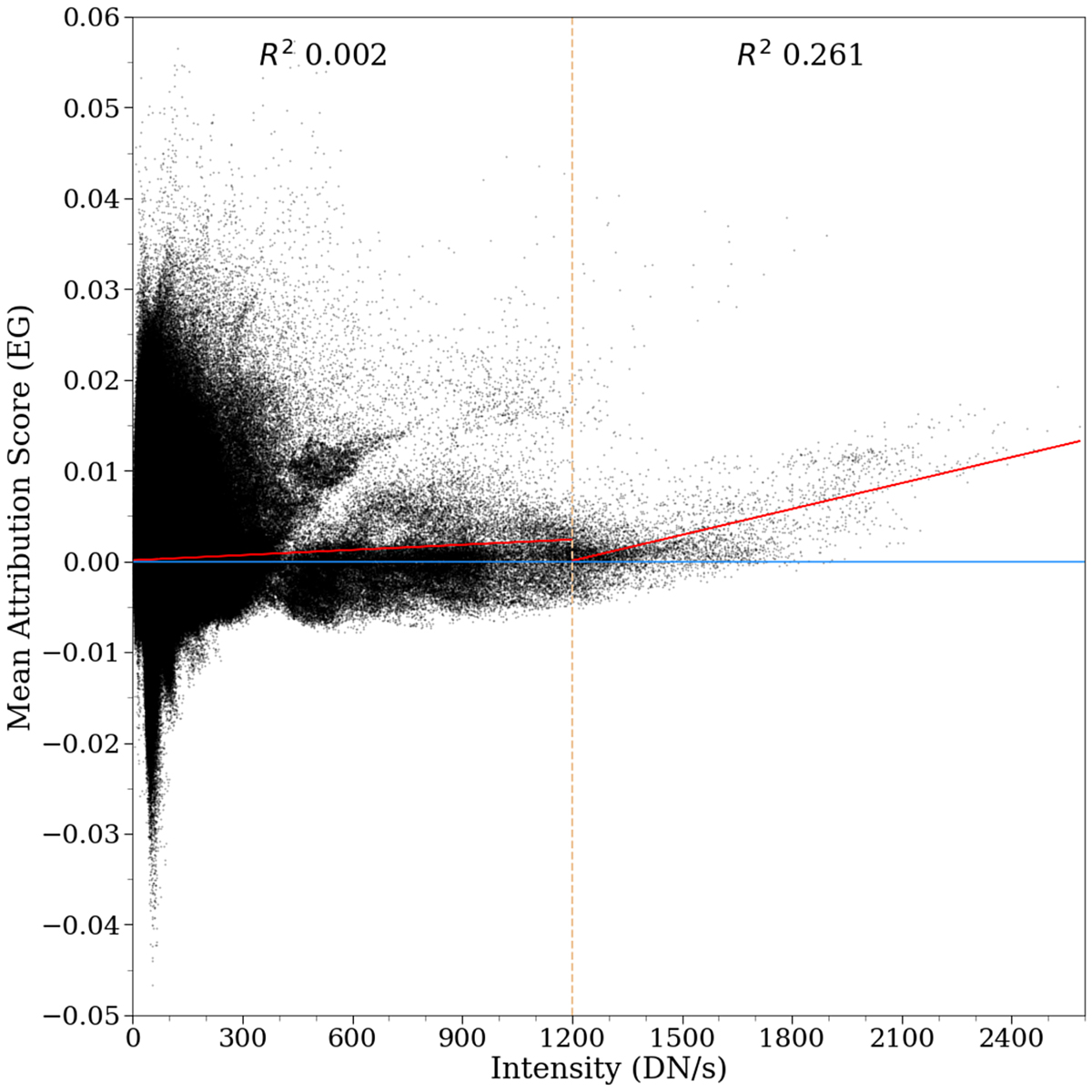
Fig. 15.
Download original image
Scatterplot of the average attribution using (EG) for each spectra in the PF dataset as a function of intensity (DN/s). The plot is divided into a low and high intensity regime by a dashed vertical line. The red lines in either regime represents the best linear fits, and the corresponding R2 values are provided in the upper part of each regime. We see that “low intensity” spectra can still be critical for flare prediction, and that very high intensity spectra are more strongly correlated with higher prediction scores.
Current usage metrics show cumulative count of Article Views (full-text article views including HTML views, PDF and ePub downloads, according to the available data) and Abstracts Views on Vision4Press platform.
Data correspond to usage on the plateform after 2015. The current usage metrics is available 48-96 hours after online publication and is updated daily on week days.
Initial download of the metrics may take a while.