Fig. 14.
Download original image
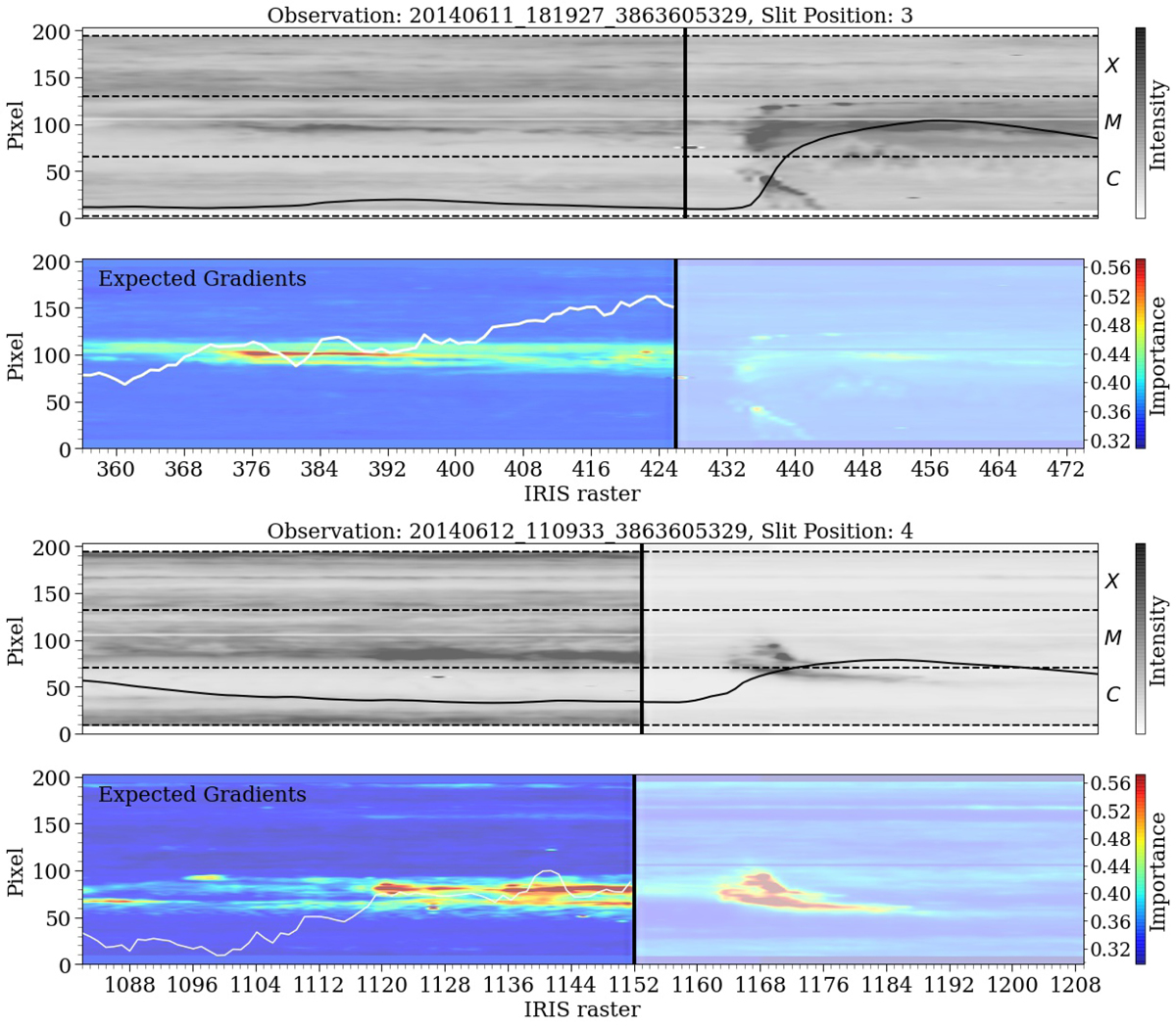
Attributions over IRIS slits. The top panel shows an intensity map (black and white) over the pixels of one of IRIS’s slit positions in time, with darker colors indicating more intense emission. The corresponding saliency map can be seen below, with warmer colors (orange, red etc.) indicating regions that are seen by the models to be important for flare prediction. The black curve in the intensity map corresponds to the GOES-curve whose flare level is indicated on the right axis, while the white curve in the attribution map is the mean prediction score as a function of time along the slit (score seen on the right axis). The bottom panel is the same but for a different observation. Both examples have an increasing prediction score closer to flare onset.
Current usage metrics show cumulative count of Article Views (full-text article views including HTML views, PDF and ePub downloads, according to the available data) and Abstracts Views on Vision4Press platform.
Data correspond to usage on the plateform after 2015. The current usage metrics is available 48-96 hours after online publication and is updated daily on week days.
Initial download of the metrics may take a while.