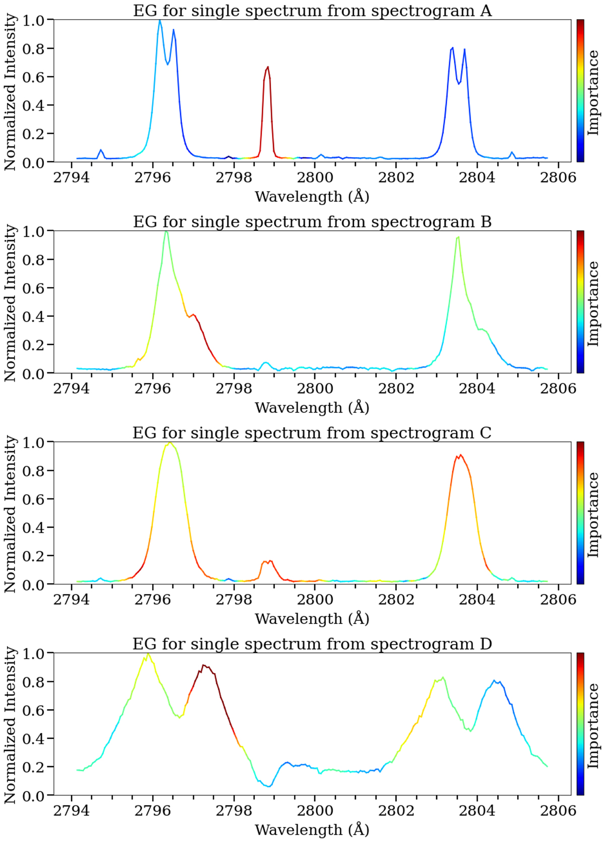
Fig. 13.
Download original image
Attributions of individual spectra associated with the saliency maps in Fig. 12. Each spectrum is a slice from the attribution maps from the locations indicated by the vertical dashed red lines. The y-axis is normalized intensity and the x-axis is wavelength in angstroms (Å). Red, orange and turquoise colors indicate features that the model associates with precursory flare activity.
Current usage metrics show cumulative count of Article Views (full-text article views including HTML views, PDF and ePub downloads, according to the available data) and Abstracts Views on Vision4Press platform.
Data correspond to usage on the plateform after 2015. The current usage metrics is available 48-96 hours after online publication and is updated daily on week days.
Initial download of the metrics may take a while.