Open Access
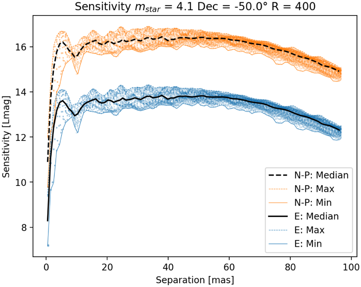
Fig. 13
Download original image
Radial scatter plot representation of each pixel of the sensitivity map. The map shows the test TE in blue and the Neyman-Pearson test TN–P in orange. Bounds of minimum, maximum, and median are also plotted. The two tests show very similar behavior except for their different sensitivity.
Current usage metrics show cumulative count of Article Views (full-text article views including HTML views, PDF and ePub downloads, according to the available data) and Abstracts Views on Vision4Press platform.
Data correspond to usage on the plateform after 2015. The current usage metrics is available 48-96 hours after online publication and is updated daily on week days.
Initial download of the metrics may take a while.