Fig. 4.
Download original image
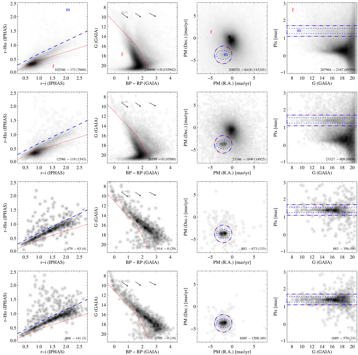
Object density in four different diagrams (one per column) and four different samples (one per row). The diagrams are, from left to right: the r-Hα vs. r − i color-color diagram using IPHAS data, G vs. BP − RP color magnitude diagrams (with three reddening vectors, at different colors), PMDec vs. PMRA, and parallax vs. G magnitudes (the last three diagrams using Gaia data). The four samples, from top to bottom, are: all objects in our catalog, objects within the XMM-Newton field of view, objects unambiguously detected in X-rays, candidate members in our sample “c” (Sect. 4.1). Density map are smoothed using a Gaussian Kernel. The grayscales range from black at maximum density to white at zero density, scaling with the square root of the density, rather than linearly, to reveal more details at low-densities. Isolated gray dots in low-density areas indicate individual stars. Dashed and solid lines delineate member and field loci, respectively, and, in the first row, “m” and “f” labels help clarify the distinction between the two. Dotted lines in the last two diagrams refer to more conservative member loci. The first number in the bottom-right corners indicate the total number of plotted objects. The following ones refer to the number of stars in the member- and field-loci, with 3- and 2-σ significance, respectively.
Current usage metrics show cumulative count of Article Views (full-text article views including HTML views, PDF and ePub downloads, according to the available data) and Abstracts Views on Vision4Press platform.
Data correspond to usage on the plateform after 2015. The current usage metrics is available 48-96 hours after online publication and is updated daily on week days.
Initial download of the metrics may take a while.