Fig. 14.
Download original image
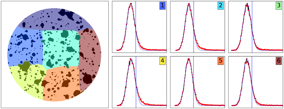
ORIGIN PCA thresholds. The left image displays the field segmentation in 6 zones. The 6 plots show the corresponding histograms of the PCA test statistics for each zone. The red curves exhibit the Gaussian fit of the distribution. The computed thresholds are displayed as blue vertical lines. They identify the minimum value above which the spectrum triggers the PCA cleaning process. This value corresponds to the 10% upper quantile of the empirical distribution.
Current usage metrics show cumulative count of Article Views (full-text article views including HTML views, PDF and ePub downloads, according to the available data) and Abstracts Views on Vision4Press platform.
Data correspond to usage on the plateform after 2015. The current usage metrics is available 48-96 hours after online publication and is updated daily on week days.
Initial download of the metrics may take a while.