Fig. 7.
Download original image
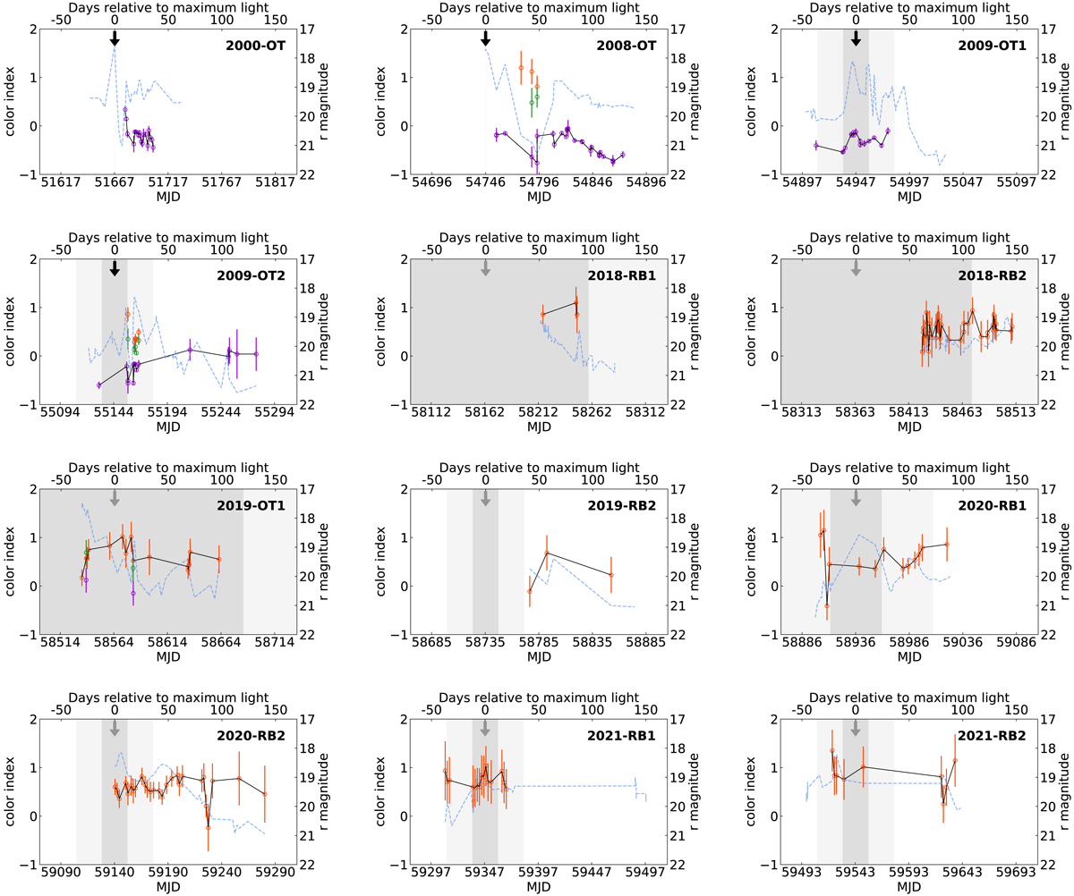
Cutouts of the color evolution shown in Fig. 6 for each outburst with available data. Each cutout shows the time interval from 50 days prior to the estimated time of maximum light based on Eq. (1) to 150 days afterward. The respective time of outburst is marked by an arrow (black for known outbursts and gray for suspected and newly detected ones) and the gray shaded area corresponds to its uncertainty in the same way as in Fig. 6. Orange data points correspond to g − r, green to g − i, and purple to r − i. The color with the best sampling is connected by a solid black line. The blue dashed line shows the r-band light curve for comparison.
Current usage metrics show cumulative count of Article Views (full-text article views including HTML views, PDF and ePub downloads, according to the available data) and Abstracts Views on Vision4Press platform.
Data correspond to usage on the plateform after 2015. The current usage metrics is available 48-96 hours after online publication and is updated daily on week days.
Initial download of the metrics may take a while.