Fig. 6.
Download original image
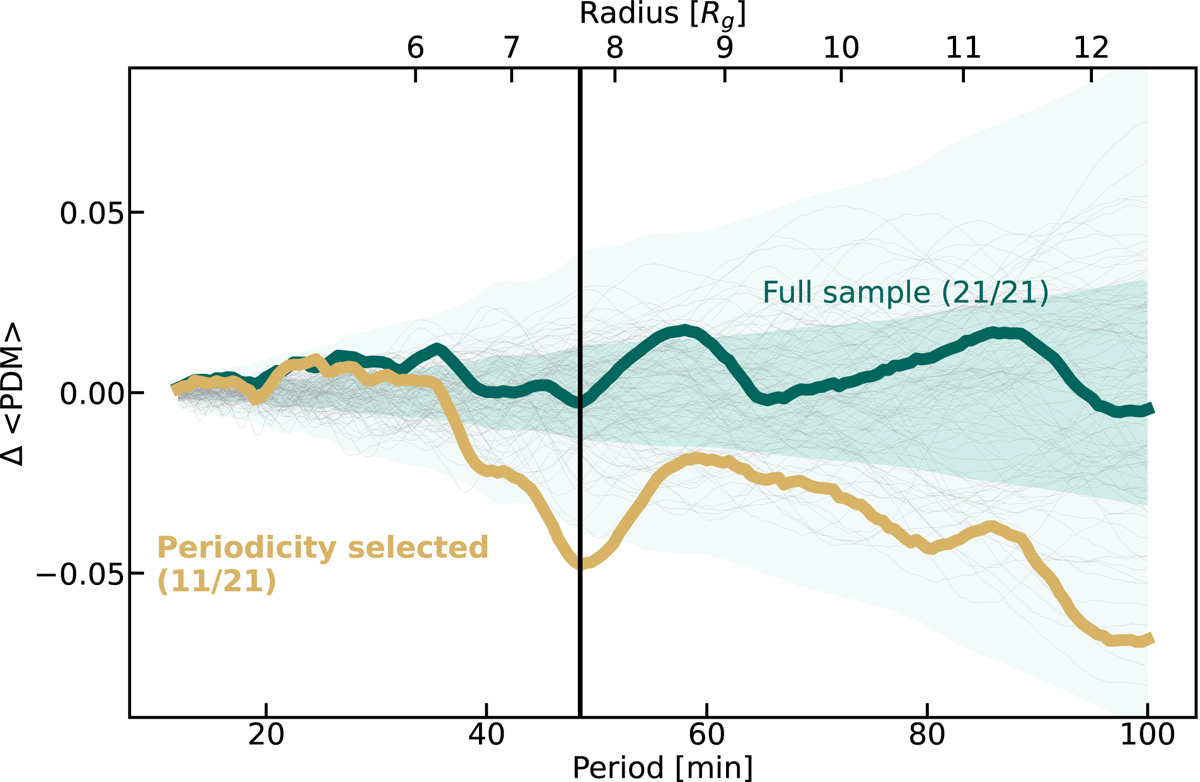
Phase dispersion as a function of period and radius of the hot-spot orbit. The thick green curves show the accumulated PD of all Spitzer data segments that lie above the fluence threshold. The gray curves show the accumulated PD of 100 simulated red-noise light curves with auto-correlation properties consistent with the observed Spitzer light curves. The green shades show the 1σ and 3σ contours. The thick yellow curve shows the subset of data segments with the most pronounced periodicity at 50 min. This subset contains 11 out of the 21 original data segments.
Current usage metrics show cumulative count of Article Views (full-text article views including HTML views, PDF and ePub downloads, according to the available data) and Abstracts Views on Vision4Press platform.
Data correspond to usage on the plateform after 2015. The current usage metrics is available 48-96 hours after online publication and is updated daily on week days.
Initial download of the metrics may take a while.