Fig. 5.
Download original image
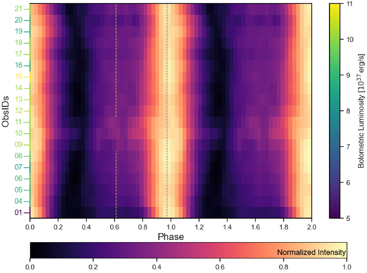
Heat map of NICER pulse profiles from GRO J1750-27 as monitored during the 2021 outburst. The black vertical dashed line at spin phase ∼0.95 marks the pulse profile peak for ObsID 01. The bottom horizontal bar shows the color-coded normalized intensity. The color-coded ObsIDs reported on the left y-axis show the bolometric luminosity (as derived by Swift/BAT count rates, see text) at each ObsID as illustrated by the color bar to the right. The vertical yellow dashed line at spin phase ∼0.6 confines the ObsIDs where the secondary peak appears more prominently. Pulse profiles are plotted twice for clarity and bins have been smoothed with a Gaussian filtering for visibility purpose.
Current usage metrics show cumulative count of Article Views (full-text article views including HTML views, PDF and ePub downloads, according to the available data) and Abstracts Views on Vision4Press platform.
Data correspond to usage on the plateform after 2015. The current usage metrics is available 48-96 hours after online publication and is updated daily on week days.
Initial download of the metrics may take a while.