Fig. 11
Download original image
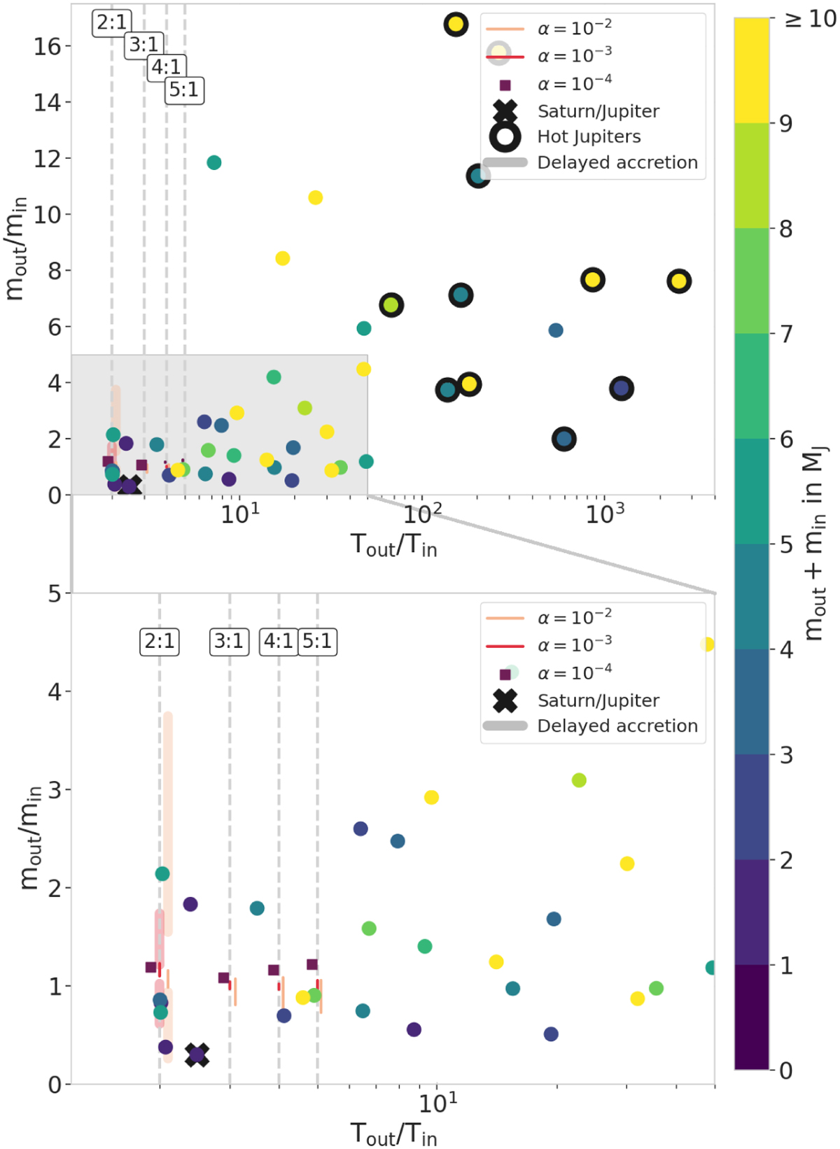
Mass ratio evolution of the two accreting planets as a function of their period ratio compared to exoplanetary systems. The investigated period ratios from our simulations are marked by vertical dashed gray lines. The data are taken from the NASA exoplanet archive, for which we selected the systems as follows: the system contains exactly two detected planets, both of them larger than 0.3 MJ. They orbit a single Sun-like star (4700 K < Teff < 6500 K and log(g*) > 4). The color of the dots represents the sum of the planet masses in Jupiter masses, without error bars. A black contour surrounds planets that are considered hot Jupiters (i.e., with a period of less than 10 days). As we expect their formation to be highly influenced by the dynamics of the system, which we do not model here, we focus the comparison with the exoplanets on the planets marked by the gray area in the top part of the figure. A zoomed-in view of this region is shown in the second panel. The vertical red and pink lines represent the maximum and minimum mass ratio reached in each of our simulations once both planets reach 0.3 MJ. Darker colors represent lower viscosities. For visibility, the lines corresponding to the different α-viscosities are slightly offset from the period ratio line. The extent of the α = 10−4 was so small at low period ratios that we represent it with squares. The cross marks the Jupiter and Saturn couple. Simultaneously accreting planets lead to planets that are very similar in mass compared to the exoplanet population. Some systems seem to be consistent with simultaneous accretion; however, another mechanism is needed to explain the existence of the other systems. Delayed accretion as shown in Fig. 10 coupled with different disk lifetimes could explain the difference in planetary masses.
Current usage metrics show cumulative count of Article Views (full-text article views including HTML views, PDF and ePub downloads, according to the available data) and Abstracts Views on Vision4Press platform.
Data correspond to usage on the plateform after 2015. The current usage metrics is available 48-96 hours after online publication and is updated daily on week days.
Initial download of the metrics may take a while.