Fig. 10
Download original image
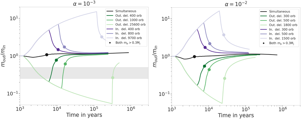
Mass ratio as a function of time for different accretion delays on the inner (purple lines) or the outer planet (green lines). The planets are located in the 2:1 period ratio configuration. The two panels represent two different viscosities: α = 10−3 in the left panel and α = 10−2 in the right. Darker lines represent shorter delays. Note that this time the mass ratio is displayed on a logarithmic scale (previous plots are on a linear scale) due to the extreme mass ratios induced by our initial setup here. The dots mark the moment when both planets have reached at least 0.3 MJ and can be considered gas giant planets. The gray rectangle represents the region where the mass ratio lies between 0.25 and 0.5 and shows the region where Jupiter and Saturn meet the required conditions to enter common outward migration, for α ≲ 10−3 (Masset & Snellgrove 2001; Pierens et al. 2014). Independent of the viscosity, all the mass ratios quickly tend toward the mout/min = 1 line, leading to similar planet masses in both cases (0.8 < mout/min < 2 after 105 yr).
Current usage metrics show cumulative count of Article Views (full-text article views including HTML views, PDF and ePub downloads, according to the available data) and Abstracts Views on Vision4Press platform.
Data correspond to usage on the plateform after 2015. The current usage metrics is available 48-96 hours after online publication and is updated daily on week days.
Initial download of the metrics may take a while.