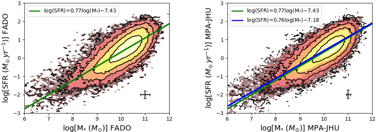
Fig. 9.
Download original image
Comparison of the star-forming main sequence with FADO and MPA-JHU data. Left panel: contour plot for FADO and linear fit to the data (green line). Right panel: contour plot for MPA-JHU (colours) and linear fit to the data (blue line) with the contours (black lines) and linear fit (green line) for FADO overplotted. The median error of the data is presented in the bottom right corner, and the linear fit equation is presented in the upper left corner. The contour plots show 20, 40, 60, 80, and 100% of the sample.
Current usage metrics show cumulative count of Article Views (full-text article views including HTML views, PDF and ePub downloads, according to the available data) and Abstracts Views on Vision4Press platform.
Data correspond to usage on the plateform after 2015. The current usage metrics is available 48-96 hours after online publication and is updated daily on week days.
Initial download of the metrics may take a while.