Fig. 7.
Download original image
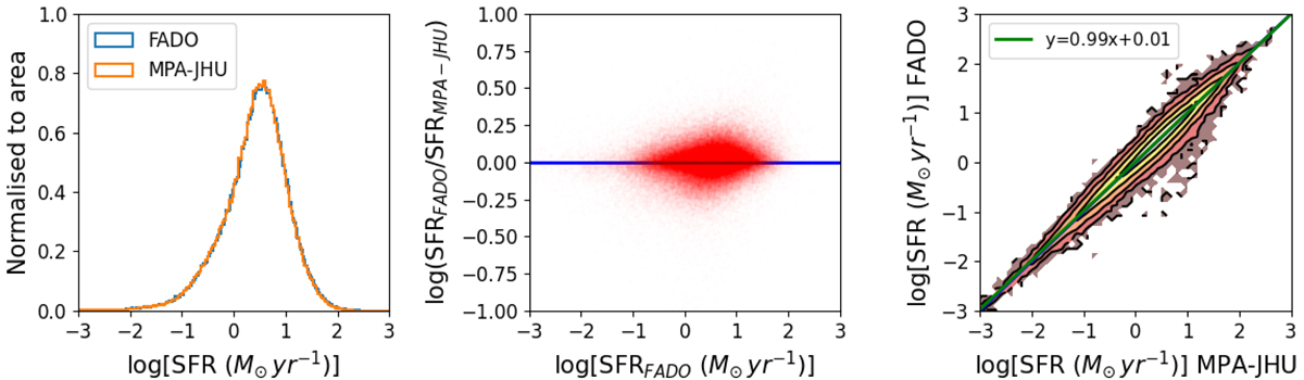
Comparison of the SFR between FADO and MPA-JHU. Left panel: histogram of log(SFR) for FADO (blue) and MPA-JHU (orange). Middle panel: scatter plot of the logarithm of the ratio of the SFR from FADO and MPA-JHU as a function of log(SFR) for FADO. Right panel: 1:1 contour plot showing 20, 40, 60, 80, and 100% of the sample and linear fit to the data (green line).
Current usage metrics show cumulative count of Article Views (full-text article views including HTML views, PDF and ePub downloads, according to the available data) and Abstracts Views on Vision4Press platform.
Data correspond to usage on the plateform after 2015. The current usage metrics is available 48-96 hours after online publication and is updated daily on week days.
Initial download of the metrics may take a while.