Fig. 2.
Download original image
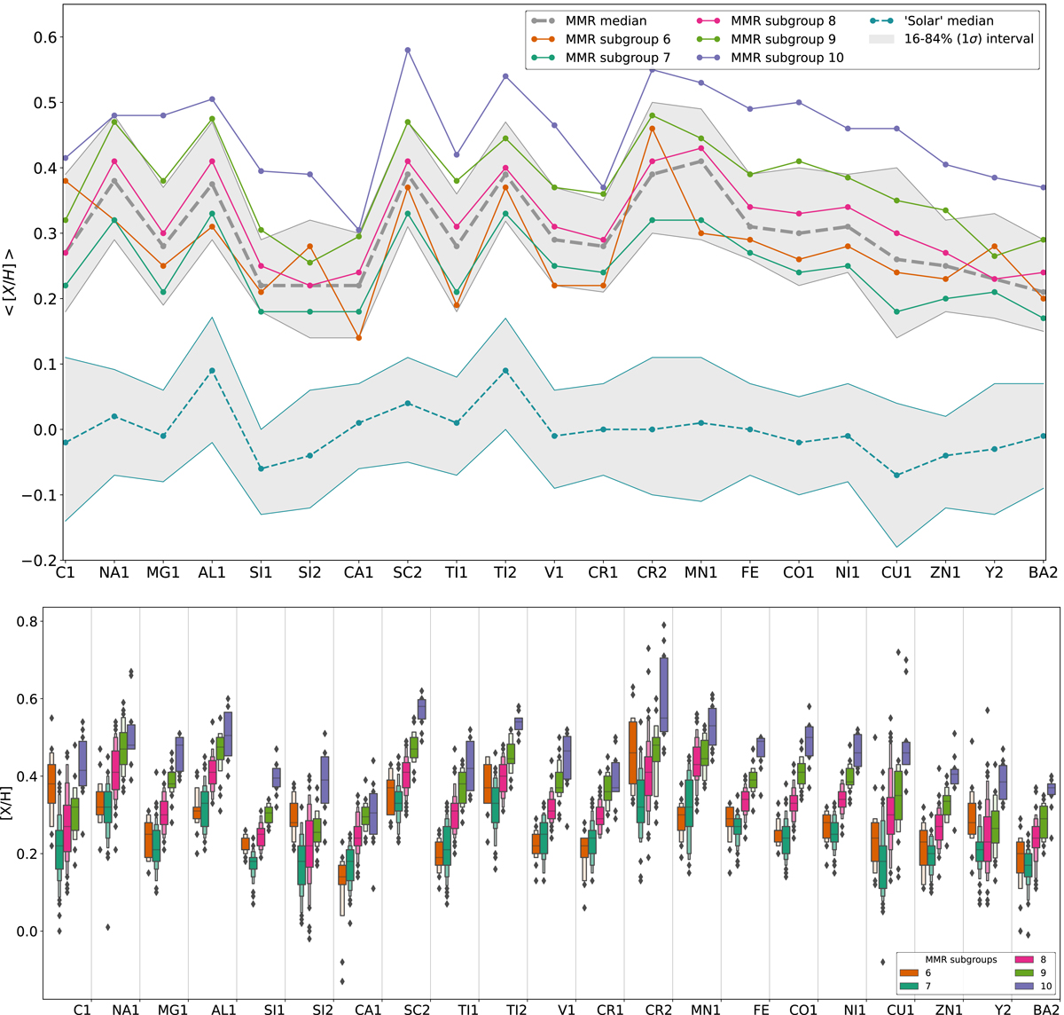
Distribution of the individual species used in the HC. Top panel: median abundances ⟨[X/H]⟩ (y-axis) of each element X (x-axis) for the most metal-rich (MMR) group. The grey and cyan thick dashed lines are the median abundances of each element of the MMR and the Solar groups, respectively; the grey area represents the 1σ (16–84%) confidence interval for each one. The purple, light green, pink, dark green, and orange lines represent respectively the MMR subgroups 6 to 10 given by the hierarchical clustering in Fig. 1. This image does not represent a regression; the lines connecting the abundances act as a visual guide to depict whether the abundance of each element increases or decreases in comparison with the previous one. Bottom panel: same as top panel, but with the distributions of the same abundances ([X/H]) in the shape of letter-value plots (a more general version of the boxplot, Hofmann et al. 2017) with k_depth set as ‘trustworthy’. The colours are the same as the top panel, but with the Solar group omitted. The vertical lines divide the distributions by element. The outliers are the diamond-shaped fliers. The bottom panel was made with SEABORN, a PYTHON package for data visualisation (Waskom 2021). In both panels the abundances are shown in increasing order of atomic number.
Current usage metrics show cumulative count of Article Views (full-text article views including HTML views, PDF and ePub downloads, according to the available data) and Abstracts Views on Vision4Press platform.
Data correspond to usage on the plateform after 2015. The current usage metrics is available 48-96 hours after online publication and is updated daily on week days.
Initial download of the metrics may take a while.